
Colour Scheme Ideas: A Guide to adding Colour to Your Home

Colour as Architecture, Not Decoration
It’s no secret that a Claudia Dorsch project is one that has no fear of adding colour. Whether it be through a bright paint colour, mixed patterned fabrics, or furniture that pops. For us, a colour scheme is rarely about which shades sit well together. It's closer to a piece of architecture in its own right: it shapes how a room reads, how light moves through it, and how one space leads into the next
Starting with purpose
Every room asks something different of its colour. A bedroom or reading nook tends to settle better in cool, muted tones, soft lavender, clay-inspired neutrals, that lean toward rest. A kitchen or living room can carry more warmth, mustard, burnt orange, deep forest green, tones that suit a room built for gathering rather than retreat.
Orientation matters as much as function. North-facing rooms tend to hold deep taupe, tobacco, ochre and rust particularly well, echoing tones found outdoors. South-facing rooms can take a jewel tone, a decadent plum, and let the light carry it.


Dark rooms, done properly
Small rooms are usually pushed toward pale colour on the assumption that light shades make them feel larger. Often the opposite is true. Charcoal, midnight blue, dusty lavender: deep tones can make a small room feel enveloping rather than cramped, particularly layered with velvet or mohair and a glossy finish that bounces what light there is around the room. Paired with brass or chrome, the contrast does more work than a pale wall ever could.
A black ceiling carries the same logic upward. It grounds a room and adds a note of drama that's easy to underestimate, particularly alongside dark cabinetry or a considered rug. Geometric black-and-white pattern, on a floor or a run of tile, sharpens the effect further.


Letting architecture disappear
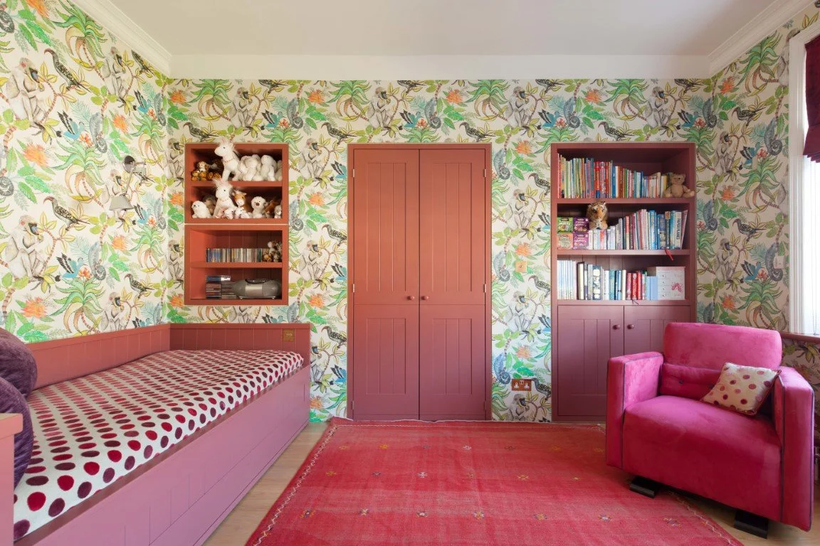
Painting cornices, skirtings and panel mouldings in the same shade as the walls lets a room's architecture recede, so the furniture and art in it can carry more weight. Colour-drenching, the same tone from floor to ceiling, takes this further still and tends to suit both period properties and contemporary spaces equally well, since it amplifies whatever architecture is already there rather than competing with it.
balance
The 60-30-10 principle remains a useful discipline: sixty per cent dominant colour, thirty per cent secondary, ten per cent accent. In a lavender and clay scheme, that might mean a gentle clay on the walls, a deeper mauve as the secondary tone, and a soft metallic or muted lavender carrying the final ten per cent. The ratio matters less than the discipline of choosing one colour to lead and letting the others support it.
Warm and cool tones layered together do similar work at a smaller scale. Clay, ochre and deep red bring intimacy; sage green, slate blue and lavender bring freshness. Soft blue in particular tends to sit comfortably against almost anything, muted neutral or vibrant accent alike.
neutrals that aren’t white
White reads as a safe choice and often ends up a cold one. Greige, taupe and light clay hold warmth in a way flat white can't, and work as well on a ceiling or a run of cabinetry as they do on a wall. Magnolia, peach and butter tones are worth reconsidering too, paired with light oak or ash and a natural fabric like flax, for a palette that reflects light without feeling stark.


Colour with intention
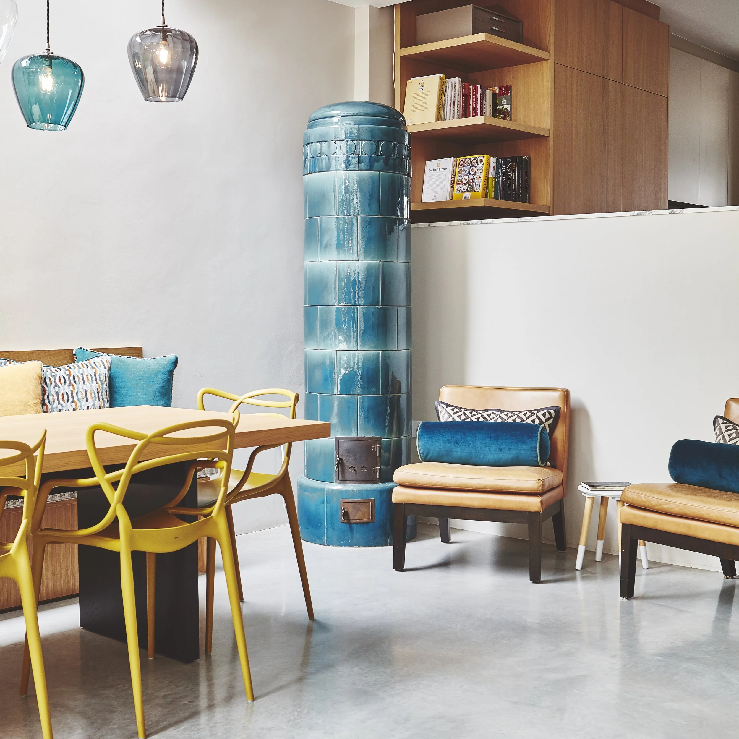
A single unexpected colour on a skirting, a cabinet, one piece of furniture, does more for a room than the same shade spread thin across it. A patterned lampshade is one of the lowest-commitment ways to introduce colour without altering the scheme underneath it. Deep burgundy and aubergine, paired with a textural white, carry a similar weight when used sparingly.
Flow between rooms
Colour chosen room by room rarely holds together as a house. Corridors, landings and staircases work best when they sit in harmony with whatever leads off them, and a home reads more considered when colour moves through it with intention rather than by accident. That doesn't rule out surprise: an unexpected note of colour, placed deliberately, can lift a transition without breaking the flow around it.
Light changes everything
The same colour shifts considerably between daylight and artificial light, and a shade that reads warm at midday can turn cold by evening. Cooler tones tend to hold up well in rooms with generous natural light, since the sun does the work of warming them; darker, warmer tones suit rooms with less light to begin with. Layering ambient, task and accent lighting gives a scheme room to adjust as the day changes around it. It's worth testing a colour on the actual wall, at different times of day, since a paint card rarely behaves the way the same shade does once it meets the room's own light, texture and neighbouring surfaces.
There is no single formula that works for every room or every client; the right palette follows from understanding how someone actually wants to feel in a space, not from a fixed set of rules applied uniformly. Colour, chosen with that kind of attention, becomes part of a room's architecture rather than a layer applied on top of it.


Do you have a project in mind or require help with adding colour to your home?