

A Place
Called Home
Interior architecture
CITY | FULHAM

An advisory role on the renovation of a Victorian townhouse, where the colour story of the whole house resolved itself around a single object: a turquoise-tiled Austrian stove.
LOCATION: Fulham, West London
PROJECT TYPE: Interior styling — colour, fabrics, wallpapers, window treatments, lighting, furniture sourcing and curation. Collaborative advisory role alongside architect, contractor and kitchen designer.
SCOPE: Interior Styling · Colour and Palette Consultation · Fabric and Wallpaper Selection · Window Treatments · Furniture Sourcing and Curation · Lighting Specification · Art Direction · Room Layout Advice
Our clients are busy professionals with two primary-school-age children, sophisticated in taste and savvy in their approach to a first serious property development. This energetic couple had very clear ideas of their own, and a first-rate team of specialists already assembled: architect, main contractor, project manager, kitchen company and interior designers. When we came on board, the house had been underpinned, the entire lower-ground floor had just been opened into one enormous front-to-back space, and the house above was propped. An ambitious reconfiguration was already taking shape.
Our brief was simple but all-encompassing: to lend a hand and a trained eye, with a compatible aesthetic, to the selection of everything. We supported the team on every decision of interior finish: tiles, flooring, marble, joinery veneers, joinery layout, paints, wallpaper, bespoke joinery design, furniture arrangement, bespoke upholstery, lighting and window treatments. We visited the clients’ previous home to review the existing furniture destined to be reused, a tasteful mix of contemporary and antique pieces that resonated immediately with our own sensibility.
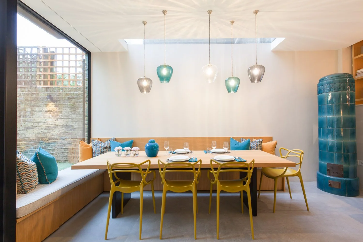
The red thread of the entire house arrived in the form of a traditional Austrian Kachelofen: a wood-burning ceramic stove with handmade deep-turquoise tiles, installed at the heart of the newly opened lower-ground kitchen. It was a connection to the clients’ roots and their memories of home, and the moment it was in place, the colour story of the whole house resolved itself.


THE BRIEF
Gutting, rebuilding and furnishing an entire house involves a multitude of decisions, large and small, and everything is interrelated. Paint colours, existing and new furniture, the shape and style of the lighting, hard and soft finishes, carpets, door handles, switches and sockets, decorative accessories. It can be overwhelming. Our role was to help the clients keep a grip on the whole picture: to assess every choice against the agreed brief and the desired aesthetic, and to ensure the scheme looked organically developed rather than assembled piece by piece.
We reviewed a range of existing objects, curtains and furniture among them, all of which had to be visualised alongside the new pieces still to be bought. Our team excels at this kind of osmosis: blending old with new, curating and refining how a selective piece is added so the result feels as though it has always been this way. The options the clients brought were all of high quality. Our task was to edit, filter and bring them together, using paint, fabric, lighting and accessories to give the whole a coherent language.
“Claudia immediately grasped our personal style and worked within our chosen direction — and most importantly within budget. She has a great eye for detail and her advice on colour and fabric was remarkable. She really pushed us to think outside the box, and yet everything blends so well within our existing scheme. We were able to make decisions very effectively and efficiently. She offered practical advice that was tried and tested, and brought a friendly and efficient quality to what can be a very stressful process. We would definitely work with Claudia again and can highly recommend her.”
- Clients, A Place Like Home—Fulham
THE ENTRANCE
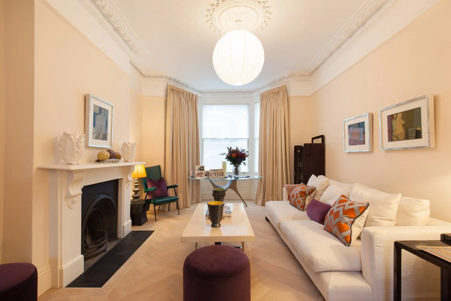
One of the first questions we worked through with the clients was which material and pattern to use in the main entrance hallway. To make the decision properly, several factors had to be weighed: colour scheme, scale, proportion and style. As with many Victorian houses undergoing modern conversion, the challenge was to achieve a marriage of styles: here, a contemporary extension and open-plan lower-ground floor reached by a new minimalist metal staircase, joined to the ground and upper floors with their existing Victorian features, the skirting, cornicing, banister, dado and architraves.
The choice lay between a small-scale, intricate Victorian replica tile and a larger, simplified retro pattern with a terrazzo finish. We mocked up the narrow, long hallway with both, and presented them alongside research on similar-sized hallways with comparable designs. The clear choice was the larger, simpler pattern. It bridges Victorian and contemporary in a single confident gesture, and the floor announces, quietly but unmistakably, that something new is happening here.


The RED THREAD
We always look for a spark, a guiding light in a new scheme that can be woven through the entire house in different guises, paired with other colours and materials, never predictable but always present. In this case the clients had already found it: the traditional Austrian Kachelofen, set in the kitchen on the newly opened lower-ground floor. A true heat source, and a connection to the clients’ roots and memories of home, it also offered a perfect blend of old and new within the contemporary extension. It became our red thread.
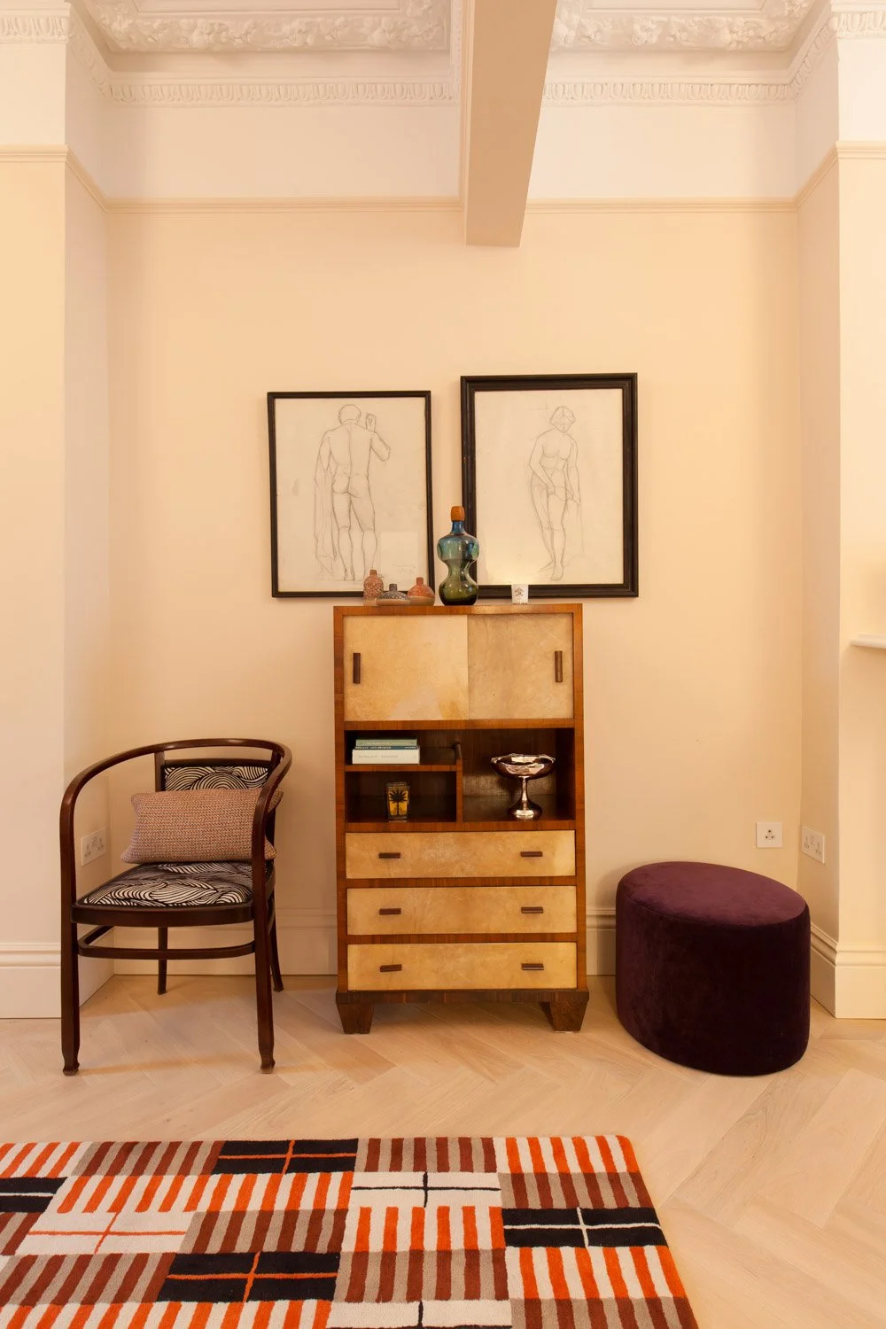
The deep turquoise of the handmade clay tiles was woven through the other spaces in small doses. Blues were paired with shades of orange, nutmeg, tanned leather and deep purple, with dashes of grey and black, a colour scheme that ran like a chorus behind the song of every individual room. The next step was to select wall colours for every room, calibrating them against the tiles and the existing pieces, then sourcing the fabrics, wallpapers and furnishings to complete the picture.


OLD AND NEW
The house came with existing pairs of curtains, several of very good quality in neutral shades. These were absorbed into the palette of teal, turquoise, cognac and grey rather than replaced. In the studio we hold a vast library of fabric swatches, collected across fifteen years of projects: far more than we ever use, kept with exactly this kind of moment in mind. Stocking a decade of swatches has its reward, in the occasional hitherto unused gem that suits a new project perfectly.
The fabric for the roman blind in the master bedroom was one of those moments. We fell in love with it at once, and from that single piece the rest of the bedroom was developed: paint, furniture, bedlinen, art, cushions, lamps. A beautiful further note is the teal seagrass wallpaper applied to the new wardrobe doors, natural, textural, warm and entirely right.
Colour and style continued to be woven through the house as the project developed. Turn-of-the-century Austrian antiques and mid-century vintage blended with contemporary furniture; terrazzo tiles with their varying splashes of colour matched against vibrant paint throughout. The study, previously something of an afterthought, changed completely with three small moves: the desk shifted to the window, the artwork hung, the shelving tidied, and a small mustard pull-out sofa added for overnight guests. Rooms that seem fixed and finished often need less than you expect, if you know what to change.
“With sensitivity and skill, the studio brought together turn-of-the-century Austrian antiques and 1950s vintage with contemporary furniture, creating a home that reflects perfect stylistic harmony.”
- Homes & Gardens, Germany—May 2025


CITY
Urban Sophistication

Surf
Coastal Serenity

Ski
Alpine Craft
Every home begins with a conversation.
Every project begins with a conversation.
If you are considering a home and would like to talk through your ideas, we would be glad to hear from you.