

Victorian townhouse
Interior architecture
CITY | NORTH LONDON

A complete renovation of a Victorian townhouse, its entire direction set by a single day spent at an art fair, before any design work had begun.
LOCATION: North London
PROJECT TYPE: Full turnkey renovation: interior architecture, structural engineering coordination, project management. Complete house from basement to top floor.
SCOPE: Interior Architecture · Interior Design · Structural Engineering Coordination · Spatial Planning · Bespoke Joinery and Furniture · Colour and Materials · Lighting Design · Project Management

A young professional couple came to us with the ambition, and the courage, to do it properly: a complete turn-key renovation of their Victorian townhouse, designed not just for the life they were living but for the one they were planning. A family was growing. The house needed to grow with it. The structural brief was clear. What it lacked entirely was an aesthetic one. The couple knew they wanted something personal and enduring, but not yet what that looked like.
Before a single sample was pulled or a mood board assembled, we spent a day at an art fair together. This is not a standard part of any interior design process. It was a deliberate decision: to discover the clients’ taste through direct encounter with works of art, rather than through images on a screen. What people respond to when standing in front of a painting tells you things about how they see the world that no questionnaire can reach. By the end of that day several pieces had been acquired, and the direction of the entire house had resolved itself. Mid-century in spirit, pastel in tone, layered with the particular warmth of objects that carry age and story. The art came first. Everything else followed from it.
Structurally, the project was comprehensive. The house was stripped back to its bones. Structural steelwork removed chimney breasts on two consecutive floors, unlocking the footprint for a bespoke kitchen below and a master bathroom above. Period features were painstakingly restored and extended throughout. Rooms were reallocated, the top floor reimagined entirely. The result is a house that looks as though it has always been exactly this way.


THE BRIEF
The most important day of this project did not happen in the studio. It happened at an art fair, before any design work had begun, when the clients and Claudia spent a day moving through the gallery stands together: looking, responding, discussing what they were drawn to and why.
This is not a process that can be rushed, or replicated by sharing images online. Standing in front of a work of art is a different experience from viewing it on a screen: the scale, the surface, the way it holds the space around it, the physical response it produces. What people choose to stop at, what they move past, what they find themselves returning to: these responses reveal something about how a person sees the world that no questionnaire or reference board can reach. By the end of that day, several pieces had been acquired. More importantly, a design language had been found. Mid-century in spirit, pastel in its tonal warmth, layered with objects of age and story.
The pieces bought at that fair became the guiding thread of the entire interior. Every subsequent colour decision, every material choice, every piece of joinery was developed in relation to them. This is the sequence we believe in: understand the person, then understand their taste, then build the space around both. The art fair was the moment the brief became a vision.
“After buying our first home together, we really wanted to make it our own but did not know where to start. Getting in touch with Claudia Interiors was the best decision we could have made. We learnt very early on that we could trust Claudia’s judgement, which made everything so easy and enjoyable. The team were incredibly professional, helpful and wonderful to work with. We are delighted with our home and would recommend working with Claudia without any hesitation.”
- Clients, Victorian Townhouse—North London
THE ARCHITECTURE
With very few exceptions, the house was stripped back to structure. Structural engineers designed steelwork to remove chimney breasts in the rear rooms on two consecutive floors, the single intervention that made everything else possible. Those removed breasts liberated the footprint for the bespoke kitchen below and the master bathroom above: two rooms that had been compromised by Victorian infrastructure, turned into two of the finest spaces in the house.
Period features were not abandoned. They were reinstated. Only the hallway had retained its original architectural detail. This was painstakingly cleaned, repaired and used as the template for the cornicing, skirting and architrave detail extended consistently throughout the building. A Victorian house with a mid-century interior still needs architectural coherence. Getting these details right meant the two design languages could sit together without conflict.
Room allocation was rethought entirely. The master bedroom moved to the first-floor front, taking advantage of the high ceilings and generous bay window the previous layout had underused. The adjacent room became a nursery. A small rear bedroom, freed by the chimney breast removal, became the master bathroom. A cramped WC was enlarged and fitted with bespoke joinery that conceals the laundry room entirely. On the top floor, a poorly divided space was opened up into a continuous office and entertainment environment.


The KITCHEN
The kitchen is the heart of this project. Before the structural work it was a compromised room — the chimney breast cutting into the footprint, the layout working against the family rather than for them. After the steelwork, the floor plan opened and the brief became clear: a kitchen as beautiful as it is functional, mid-century in spirit, built for a household that cooks, gathers and lives in it every day.
The terrazzo floor anchors the space — hand-varied in colour, textural and warm in a way no uniform surface can be. Moroccan zellige tiles on the backsplash introduce the same quality of natural variation, their irregularly glazed surfaces catching the light differently at different times of day. The palette is calibrated to the works acquired at the art fair: 1950s pastels in the cabinetry, a darker dramatic accent to define zones and frame art. Bespoke cabinetry was designed in-house with storage approached analytically — every category of item accounted for, every drawer and shelf dimensioned to purpose. Function came first. Beauty followed directly from it.


materials & palette
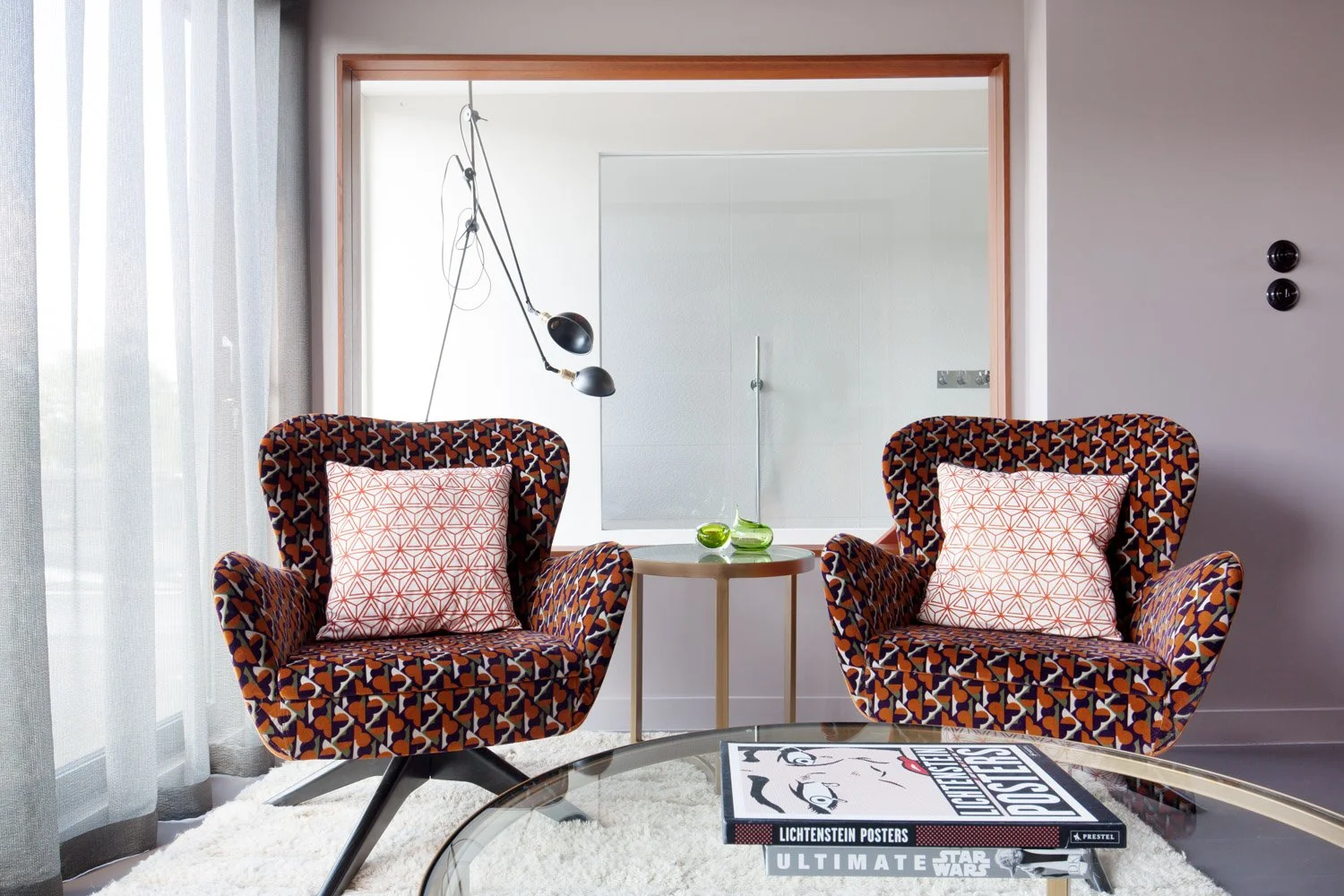
The material story of this house is one of deliberate, considered texture. Terrazzo in the entrance hall, kitchen and bathrooms. Moroccan zellige and concrete tiles alongside it. Wooden floors throughout, painted or stained to a softer register than raw timber would give. The palette of 1950s pastels, dusty pinks, sage greens, warm off-whites, is offset against deeper, more dramatic accents that define the architectural moments: the feature walls, the recesses, the spaces that hold art.
The selection process was rigorous, and ran over several months. Hundreds of samples of tile, paint, fabric and ironmongery were considered before the final palette was agreed. The mood board is not a starting point for us. It is a destination, arrived at through extensive research and honest editing. The clients trusted that process. The coherence of the result comes directly from that trust.


THE JOINERY
The bespoke joinery throughout this house grew from a single inspired decision: sourcing vintage teak sideboards and repurposing them as vanity units in the bathrooms. Those pieces then set the design language for every wardrobe and bookcase in the house. Teak-coloured stained oak with caned panelling, designed in-house and produced by our contractors. The joinery is mid-century in reference but entirely bespoke in execution. It could not have been bought off a shelf or ordered from a catalogue.
The top-floor office shows the approach at its most ambitious. A continuous suite of fitted joinery wraps the space: a multi-screen desk with dedicated storage and generous display shelving, a fully fitted bar corner, a cinema-style television area. Three distinct functions in one unbroken design language, the transitions between zones handled through the joinery itself rather than through physical dividers. The room reads as one coherent space that happens to do three different things.
THE COLLECTION
The intention for this house was always that it should look and feel organically grown and lovingly assembled over time, rather than recently renovated. That meant working alongside the clients’ existing pieces, supplementing them with a carefully curated selection of antiques, vintage finds, modern commissions and locally produced upholstery, and placing every object in relation to the art that had led the project from its first day.
The result is a house that rewards looking. Details accumulate: the ironmongery, the paint finish on a door, the angle of a light fitting, the textile on a reading chair. None of these things announces itself. Together they create the sense, which was always the intention, of a home lived in by people with genuine taste, rather than staged by people with a brief.
“The art came first. Everything else followed from it — the colours, the materials, the mood of each room.”

CITY
Urban Sophistication

Surf
Coastal Serenity

Ski
Alpine Craft
Every home begins with a conversation.
Every project begins with a conversation.
If you are considering a home and would like to talk through your ideas, we would be glad to hear from you.