

CITY Pied a terre
Interior architecture
The London Chapter

A Hampstead apartment reworked for clients returning from New York, designed as a full city home rather than a weekday base. Modern English in feel, Moroccan in palette.
LOCATION: Hampstead, London
PROJECT TYPE: Full interior architecture and design
SCOPE: Interior Architecture · Interior Design · Bespoke Joinery · Lighting · Design · Soft Furnishings · FF&E Sourcing

The clients are entrepreneurs who spent years in New York before returning to London and falling in love with Hampstead — the village feel, the Heath, the particular ease of a place that is urban and unhurried at once. When the apartment they were renting came up for sale, they bought it. The brief followed directly from who they are: a city base that works hard during the week, entertains easily at weekends, and never feels like a serviced apartment.
This was a design for a life deliberately arranged across several places — city during the week, south coast at weekends, a larger family home on the horizon. The flat had to carry its own identity, be properly equipped for the long term, and remain easy to leave on a Friday afternoon.
Inside a fixed Edwardian footprint, we reworked every room around how this family lives: opening the flat to itself, drawing the terrace into the heart of the space, and designing joinery that resolved storage, flexibility and proportion.
The palette grew from three objects the clients already owned — a walnut wardrobe, a pink Andy Warhol sunset print, and an antique marble-top escritoire. From those anchors, a whole home: Moroccan warmth without Moroccan heaviness, layered textiles and irregularly glazed tile, and a silk Marrakech-star rug the clients recognised instantly as theirs.
Modern English, with a Moroccan soul.


THE BRIEF
The brief was not about aesthetics first—it was about understanding a life, then building the interior around it. Active, social, well-travelled clients with a dog, three significant existing pieces of furniture, and a clear sense of what they did not want: anything that felt like a rental, a serviced apartment, or a compromise. They wanted a home that belonged entirely to them and that worked for every version of their London week. The three objects they brought with them were the design brief in miniature. A walnut wardrobe: dark, warm, with the quality of something chosen rather than inherited. A pink Andy Warhol sunset screen print: graphic, confident, not afraid of colour. An antique marble-top escritoire: European, considered, with the particular gravity of a well-made old thing.From the relationship between these three pieces, the entire palette of the apartment was derived.
“Claudia is a wonderful interior designer. From the start I felt she was very organised, knowledgeable and genuinely able to help merealise my ideas and make them a reality. She has a positive attitude and an open mind—she listens to your ideas and helps form them into something more complete. My husband and I enjoyed every moment of working with her and would recommend her without hesitation.”
- Client, City Pied-à-Terre—Hampstead
THE ARCHITECTURE
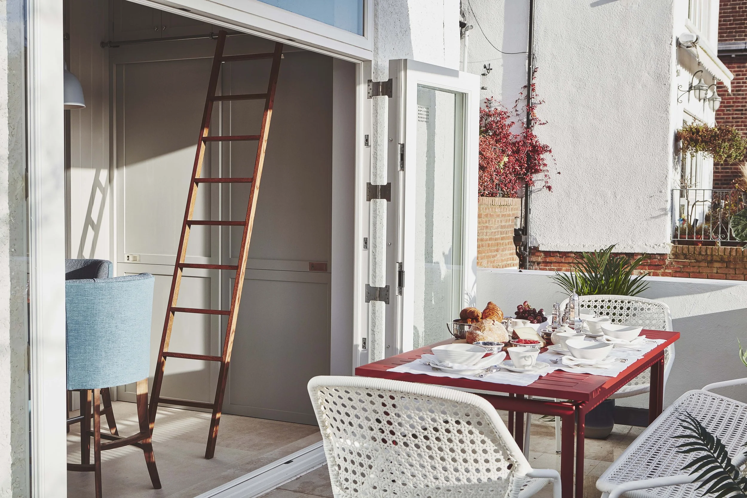
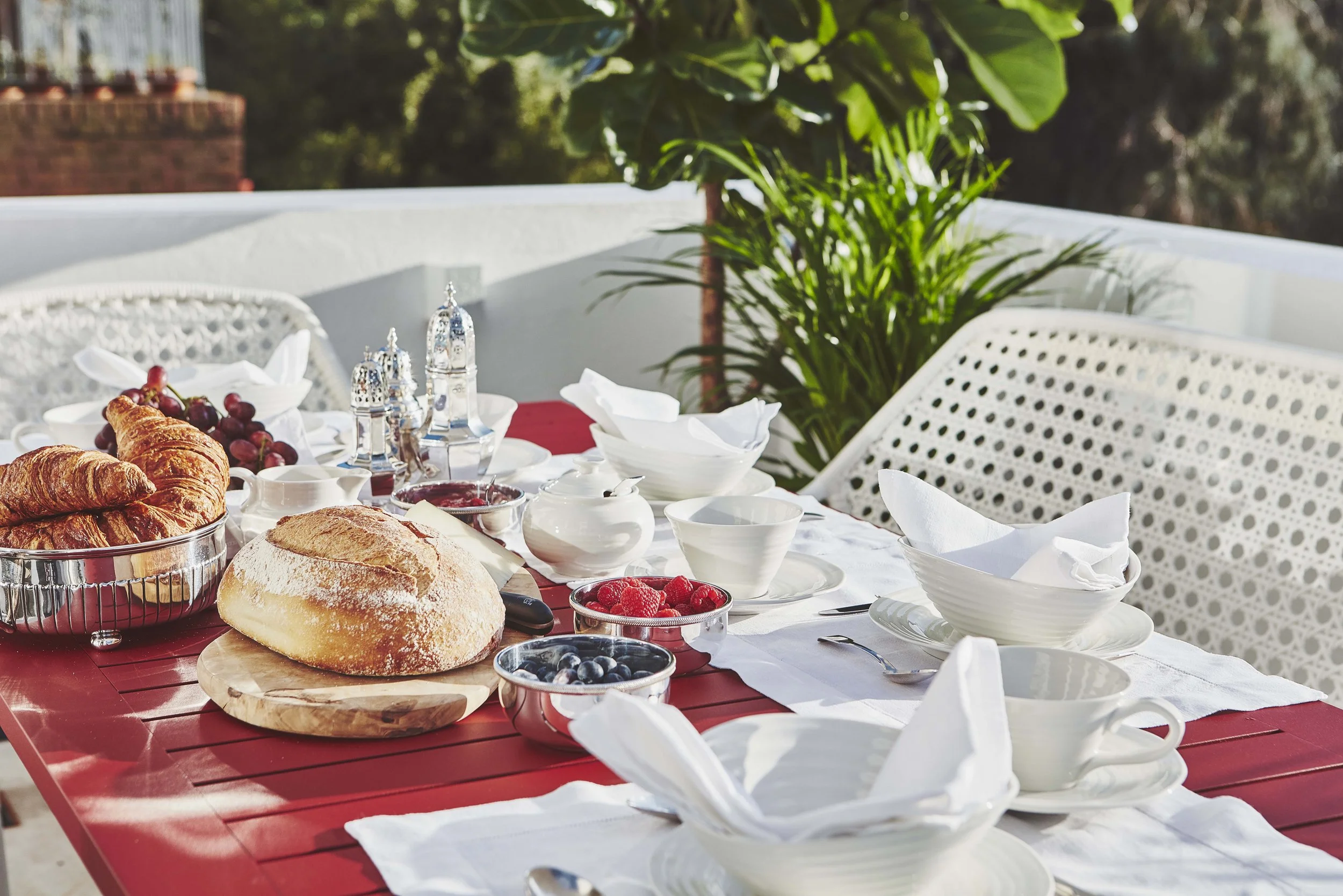
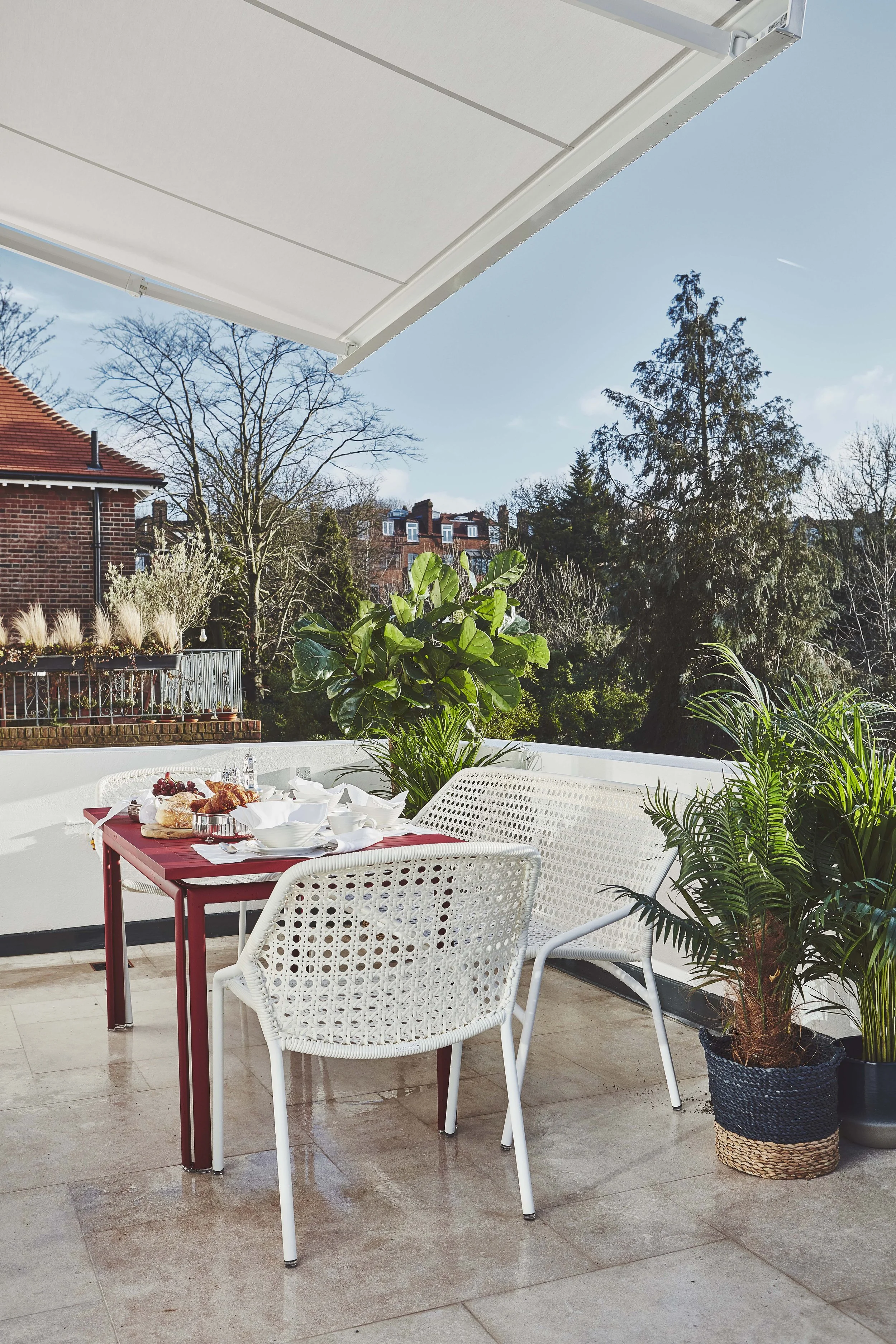
The property had good bones but a broken relationship between its spaces. The kitchen was closed off behind a wall that served no structural purpose and denied the apartment its natural light. The terrace doors were four heavy glazed leaves with bars that cut the view into strips. Most significantly: the terrace sat lower than the kitchen floor, a step down that physically and psychologically severed the two spaces. Guests used the terrace occasionally. It never felt like part of the home.
We addressed each of these in turn. The kitchen wall came down to create an open-plan kitchen and staircase hall that floods the central floor of the apartment with morning light. The terrace doors were redesigned from four leaves to three, glazing bars removed, opening to 180 degrees. We raised the terrace floor to meet the kitchen threshold exactly and laid the same natural limestone continuous from the kitchen through the hall and out across the terrace — so the two spaces now read as a single room. A bespoke remote-controlled awning with three integrated heaters means the terrace is genuinely usable twelve months of the year, not simply decorative for six.
The oak doors throughout were stained in walnut tones to match the new joinery — a small intervention that unified the whole apartment instantly and is exactly the kind of decision that takes ten minutes to specify and transforms a space permanently.


The Joinery
Storage was the apartment’s defining challenge. As a rental it had never been fitted for long-term living: no wardrobes, no proper built-in provision, no consideration of permanence or growth. We began a room-by-room process of planning every inch in relation to what it needed to hold and how it needed to work.
In the kitchen, bespoke units were designed for specific purposes — including a dedicated integrated home for Amber the dog’s bed, fitted beneath the island at exactly the right height and dimension. The dog bed is one of those details that clients mention immediately when showing the apartment to guests and that signals, more than any aesthetic choice, the depth of attention brought to the brief.
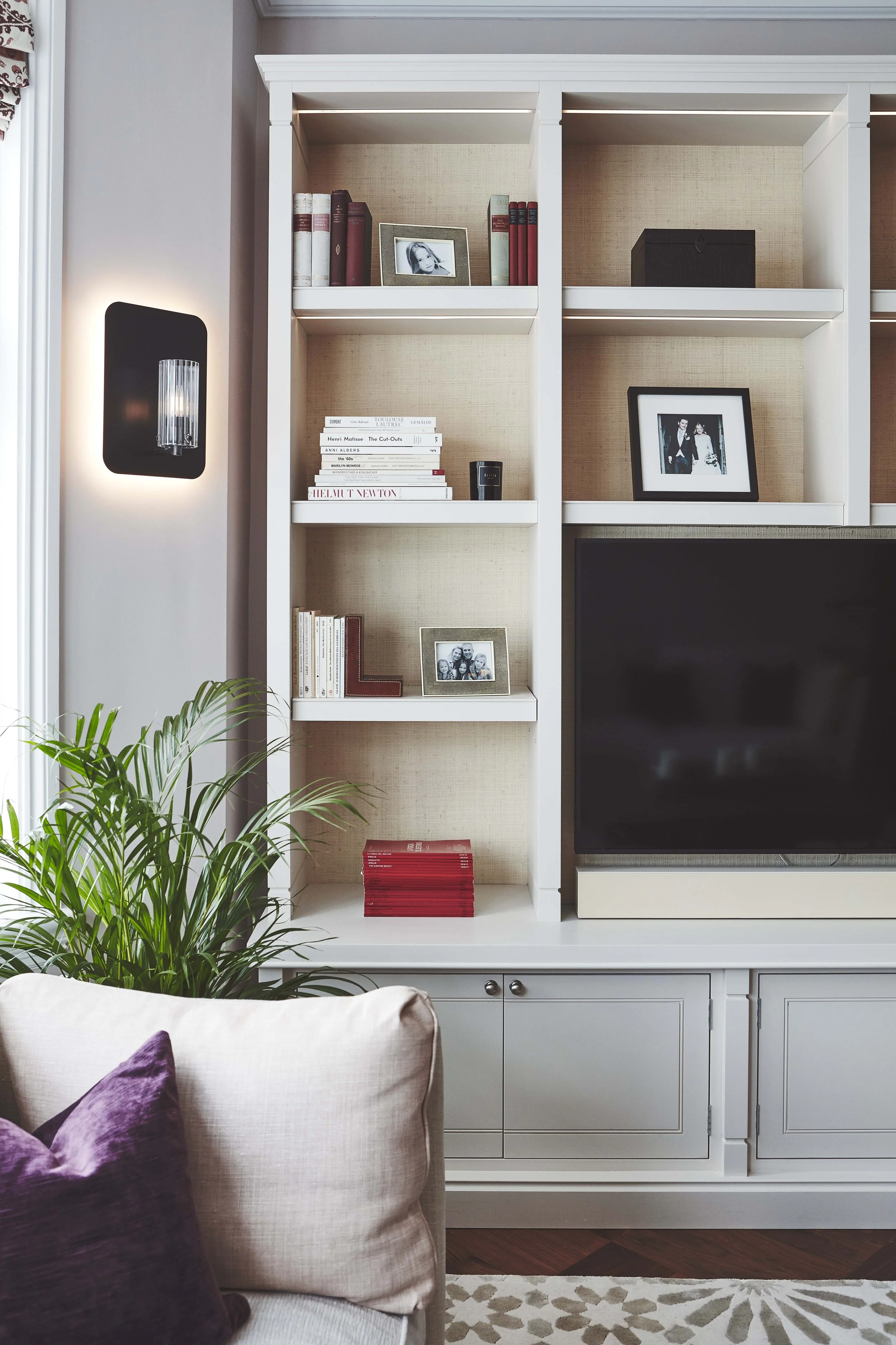
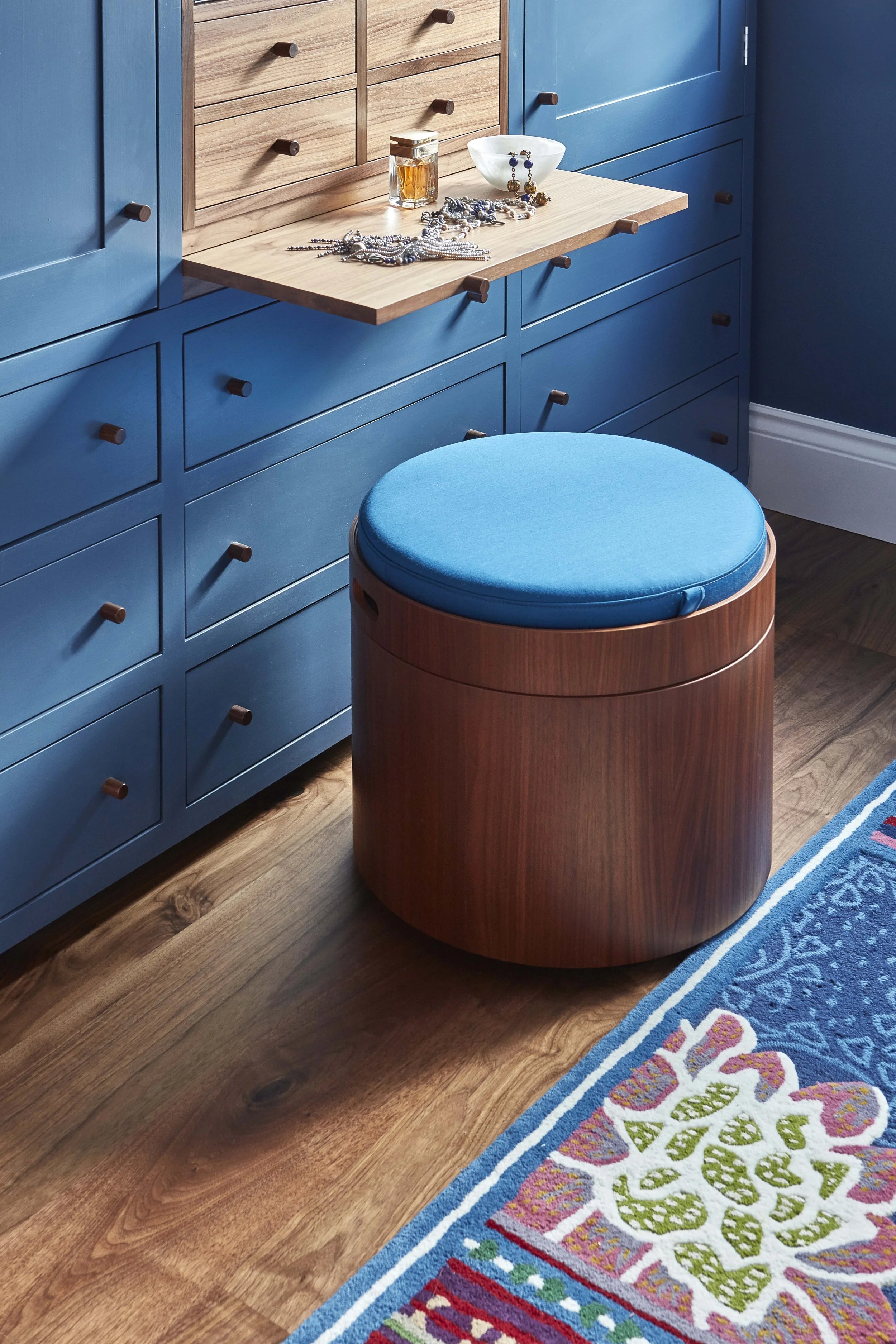
In the master bedroom, walls were moved to create a walk-through wardrobe: sliding doors, a pull-out dressing table, and Moroccan-inspired mirrored walnut vanity units that carry the warmth of the palette into a purely functional space. In the living room, two extra-large freestanding bookcases house the television and AV equipment, a home bar, crockery, glasses and a library of books — the whole social and domestic apparatus of a city flat, organised into two pieces of joinery that read as furniture rather than storage.
The study was the most spatially compromised room in the apartment and received the most precise design attention. An awkward wall was resolved with a curved bespoke bookcase that wraps its full length — a piece that could only have been made for this specific wall in this specific room. Sliding doors reclaim the floor space. A pull-out sofa accommodates overnight guests without any sense of compromise or contrivance. The room works as a study. It also sleeps two. The difference between the two states is a single pull.


THE PALETTE
The Warhol print gave the colour vocabulary from the start: pink, purple, faded coral. Those tones run through the apartment as a thread, appearing differently in each room — deep and confident in the bedroom, soft and layered in the living room, grounded and earthy in the study.
The master bedroom is deep blue walls with crisp cream on the bed and window treatments, anchored by a colourful rug. The blue is the kind that reads differently at different times of day — rich and enveloping in the evening, quieter and more settled in the morning light that comes in from the Hampstead street. The master bathroom has irregularly glazed pink and white tiles: handmade, deliberately imperfect, with the particular beauty of a surface that is not the same in any two places.
The living room is softer: pale pink, grey, deep purple, and the silk Marrakech-star rug that was the single most discussed piece in the entire project. It arrived in the studio on approval and left the same day. The study is greener and more masculine — the darkest room in the apartment, brought to life through colour rather than additional light. Large areas of cream joinery are punctuated with splashes of red and blue that prevent the darkness from becoming weight.
Flooring was limited to two types throughout: walnut parquet in the main rooms, and grey limestone in the bathrooms, halls, stairs, kitchen and terrace. This restraint — the decision to use fewer materials rather than more — is what gives the apartment its sense of coherence and calm. A home with ten floor types reads as assembled. A home with two reads as designed.


Multi-Home Living
What makes this project particularly relevant to the way we work is that it was conceived from the beginning as one home within a larger whole. These clients were deliberately organising their lives across multiple locations — city during the week, coast at weekends, a larger family home already being considered. The apartment had to carry its own complete identity and not feel like a staging post. It had to be properly equipped for long-term habitation while remaining genuinely easy to leave.
This is a pattern we understand well and work within constantly. Many of our clients live across multiple homes in different cities, different climates, different registers. Each home needs its own character, its own logic, its own sense of belonging entirely to where it is. But they also need to work in concert — the same standards of craft, the same quality of thought, the same depth of attention to how a specific family actually lives. That coherence across very different places is the thing we specialise in, and this apartment was an early and clear expression of it.
“The most satisfying brief is not ‘make it beautiful’ but ‘make it work for us.’ When you achieve both at the same time, a home becomes something worth returning to. ”

CITY
Urban Sophistication

Surf
Coastal Serenity

Ski
Alpine Craft
Every home begins with a conversation.
Every project begins with a conversation.
If you are considering a home and would like to talk through your ideas, we would be glad to hear from you.