
Highgate
Elegance
Interior architecture
Highgate, London

A penthouse duplex near the Heath, and the quiet, demanding art of designing a backdrop for a life lived across continents.
LOCATION: Highgate, London
PROJECT TYPE: Full interior architecture
SCOPE: Interior Decoration · Colour and Paint Consultation · Wallpaper Specification · Lighting Design · Art Hanging and Object Placement · Bespoke Artwork Commission · Styling
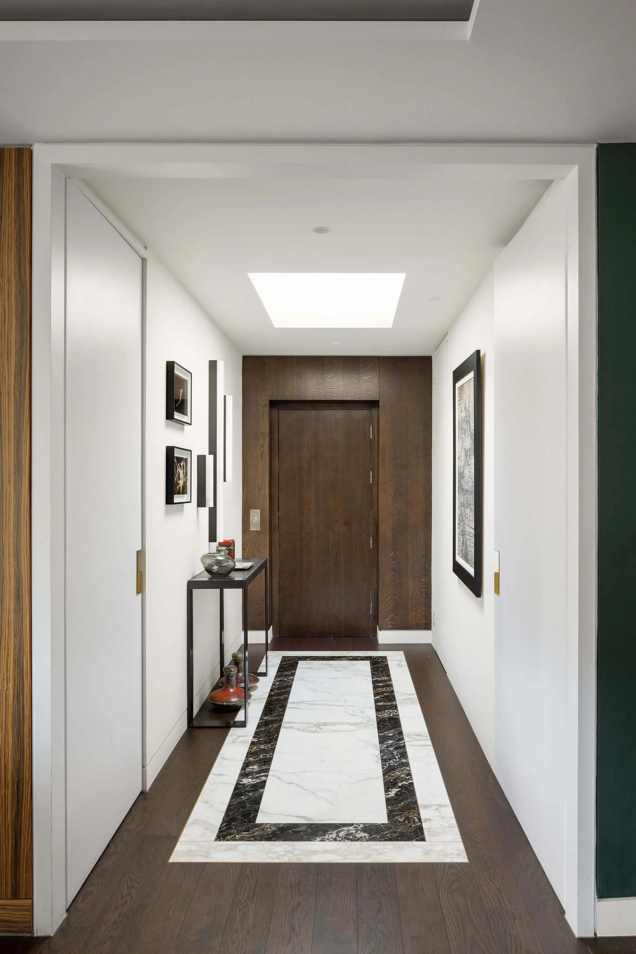
The clients arrived at a bare white penthouse duplex near Hampstead Heath, carrying with them the accumulated objects of an extraordinary life. A royal background. Ambassadorial appointments across three continents. Decades of environmental activism. An art collection drawn with genuine connoisseurship from European, Latin American and Asian traditions.
What they did not need was a designer who would impose a new identity on the space. They needed one who could receive what they already had, and give it a home.
The brief was as exacting as any we have written. Every paint colour, every wallpaper, every light fitting, every placement of an object or work of art had to feel as though it had grown there over decades rather than arrived last Tuesday. The apartment needed to look effortless. That effortlessness was the entire project.
The Brief
Not a new identity. The one that was already there.
The starting point for this project was not the apartment. It was the clients. Before we discussed a single colour or considered a single wall, we spent time understanding who these people are: the arc of their lives, the places they have lived, the objects they have accumulated and why, the art they have chosen and what it means to them, the way they move through a day and through a room.
A collection of this cultural breadth requires a particular kind of humility from the designer. The temptation in a beautiful new apartment is to impose: to bring a strong aesthetic vision that announces itself and makes the space feel designed. That would have been entirely wrong here. These rooms needed to recede gracefully behind their contents, providing a background so considered and so quietly right that the collection could speak without competition. The design had to be invisible. That is considerably harder than being visible.
The brief, then, was not decoration in any conventional sense. It was the careful calibration of colour, light and surface so that a life accumulated across decades and continents could find its natural resting place in a modern North London apartment, and look, from the first moment of arrival, as though it had always been exactly there.
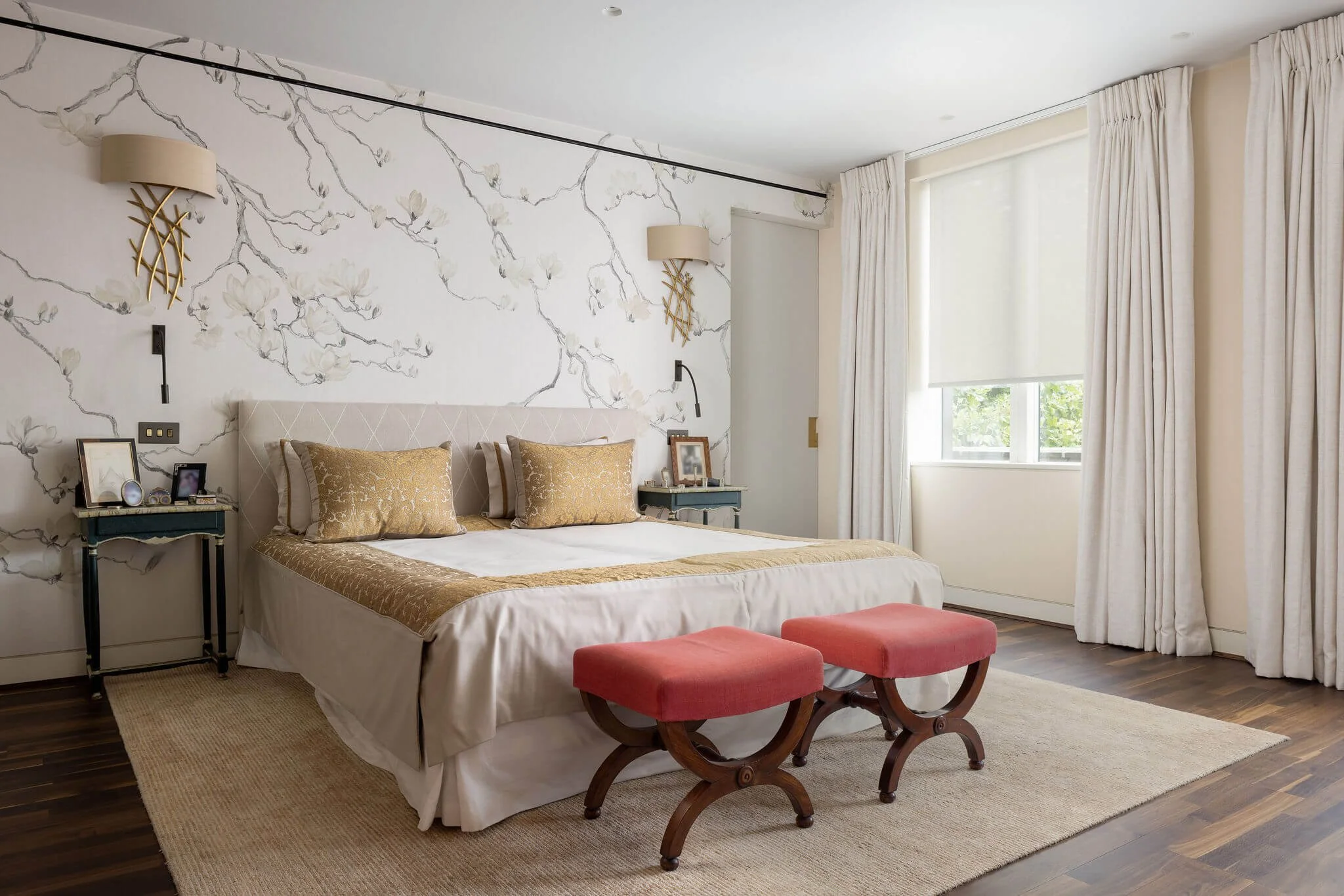
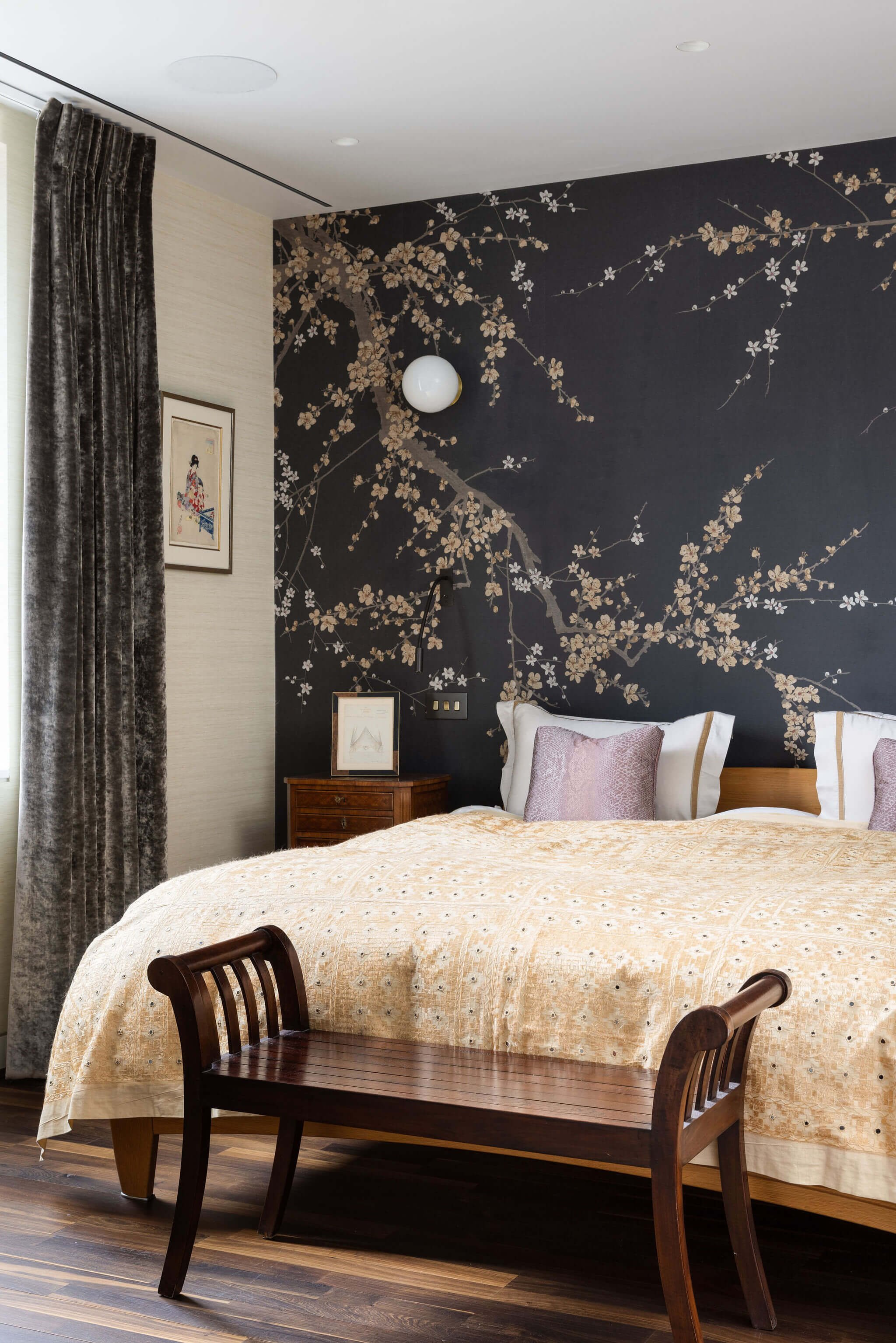
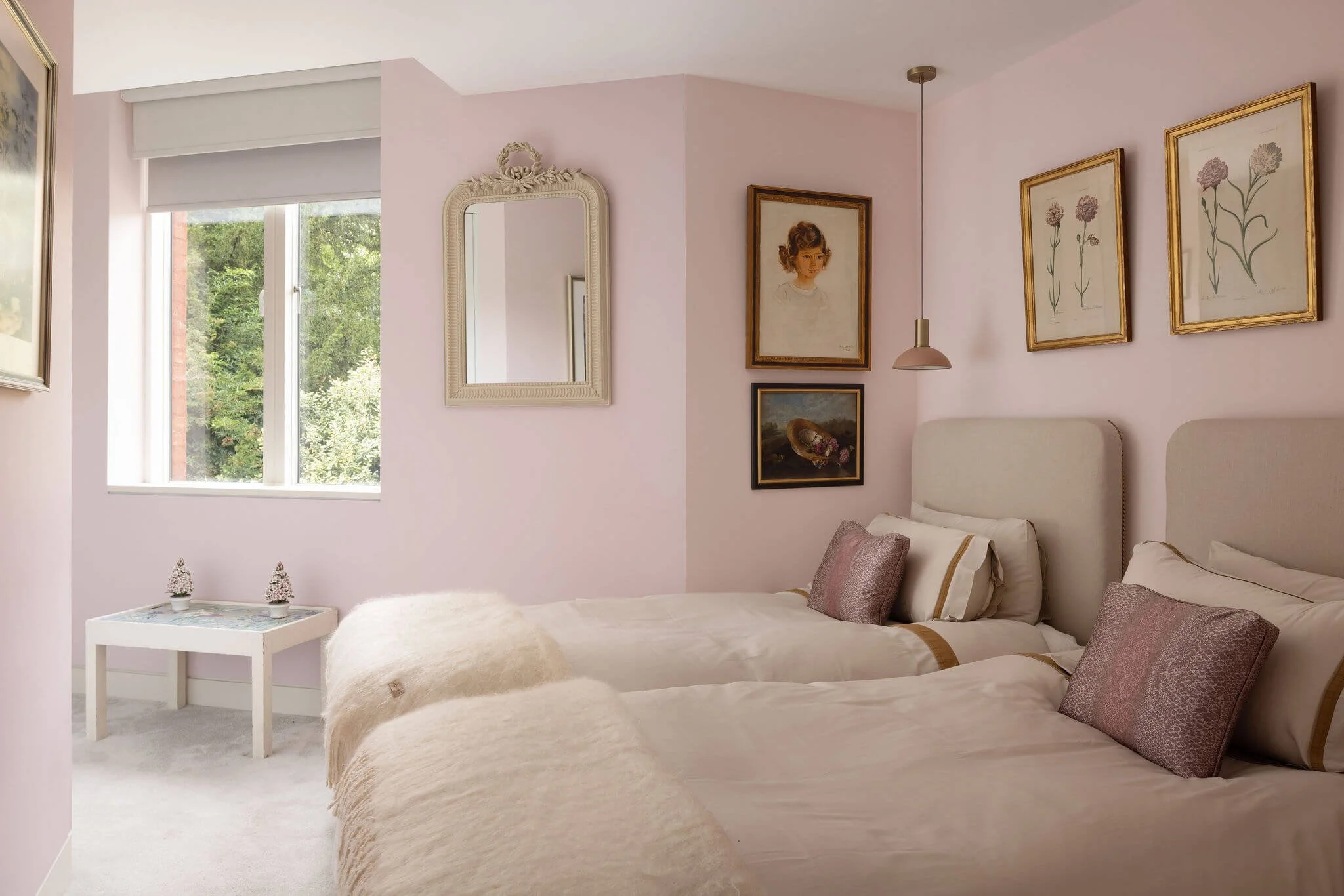
The Palette
Colours that listen.
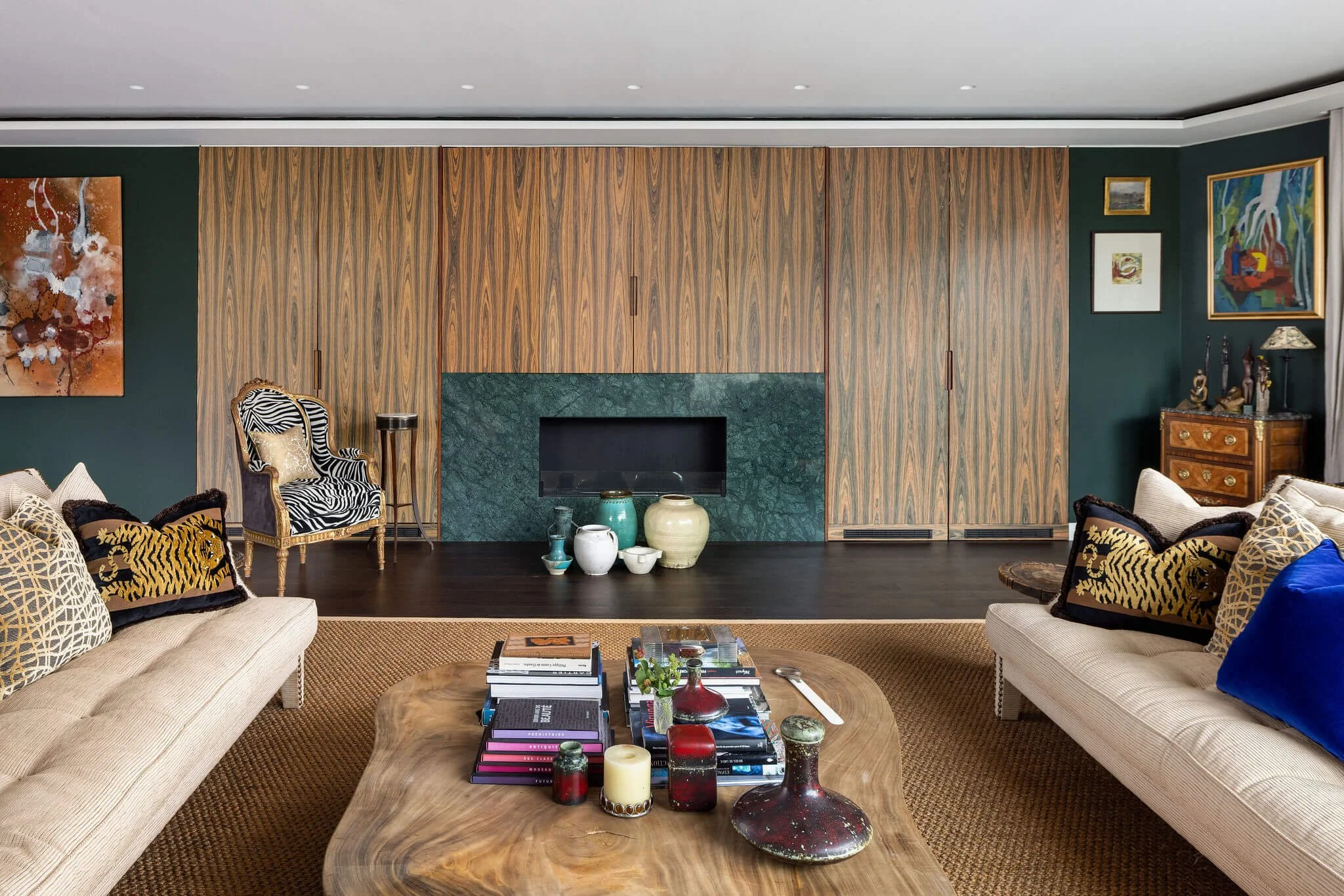
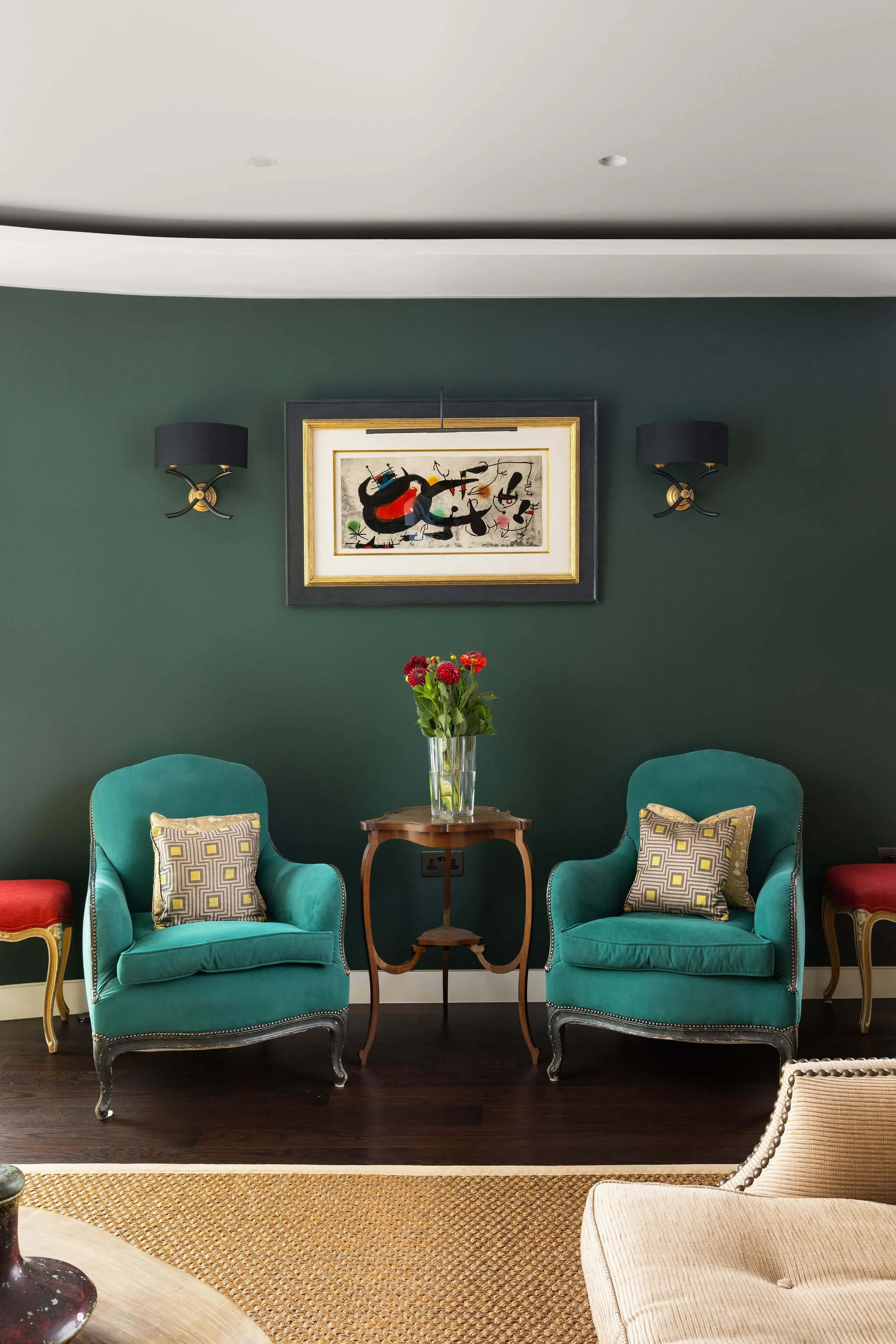
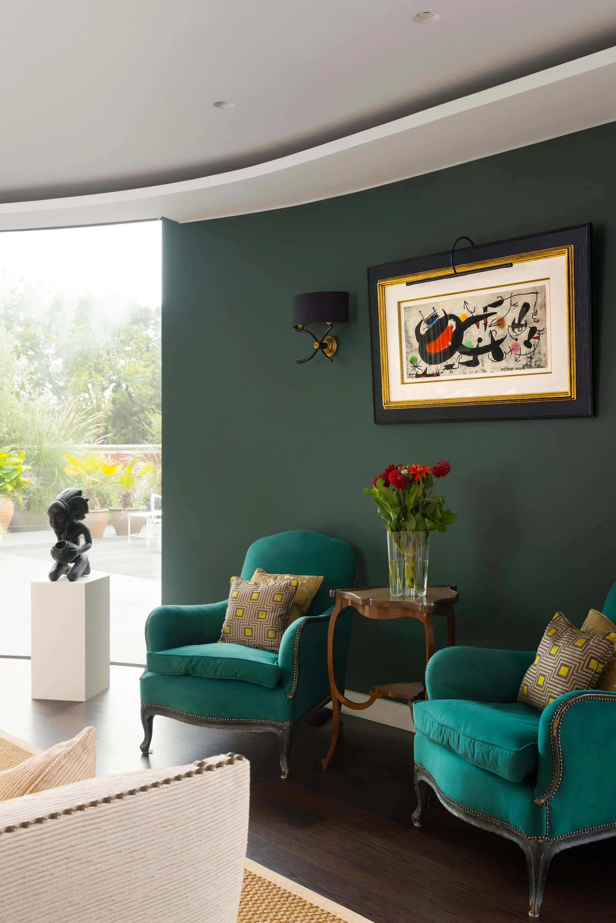
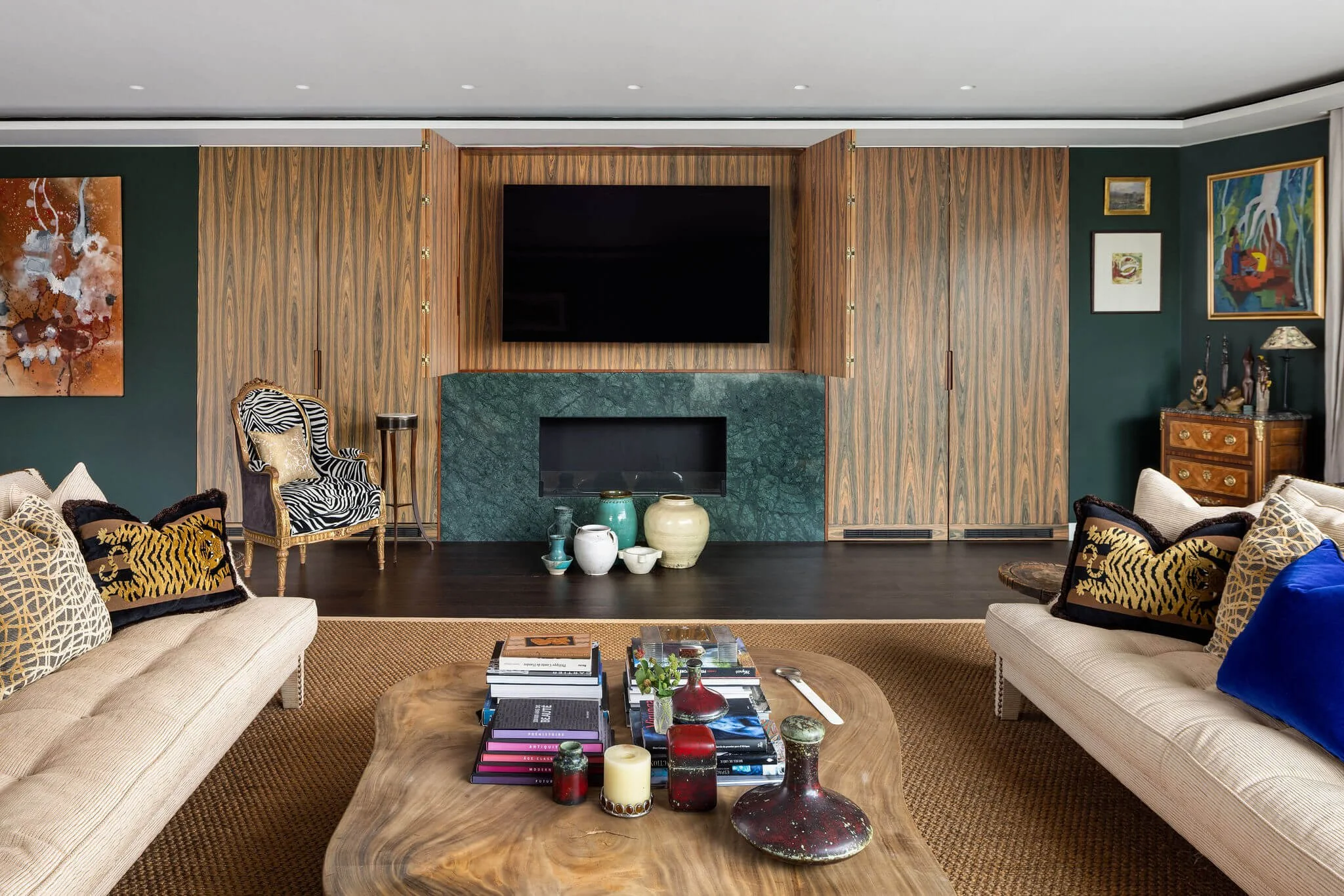
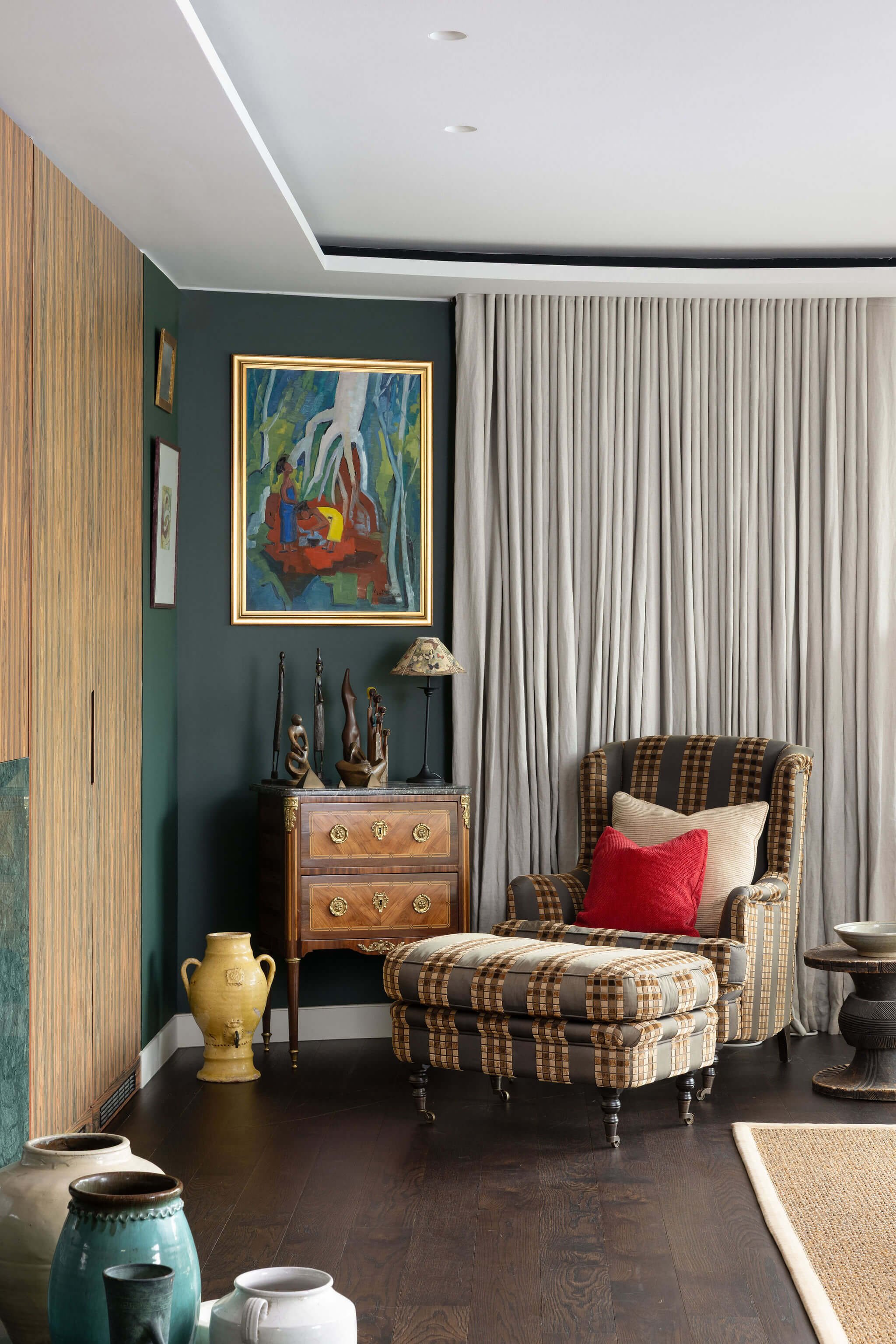
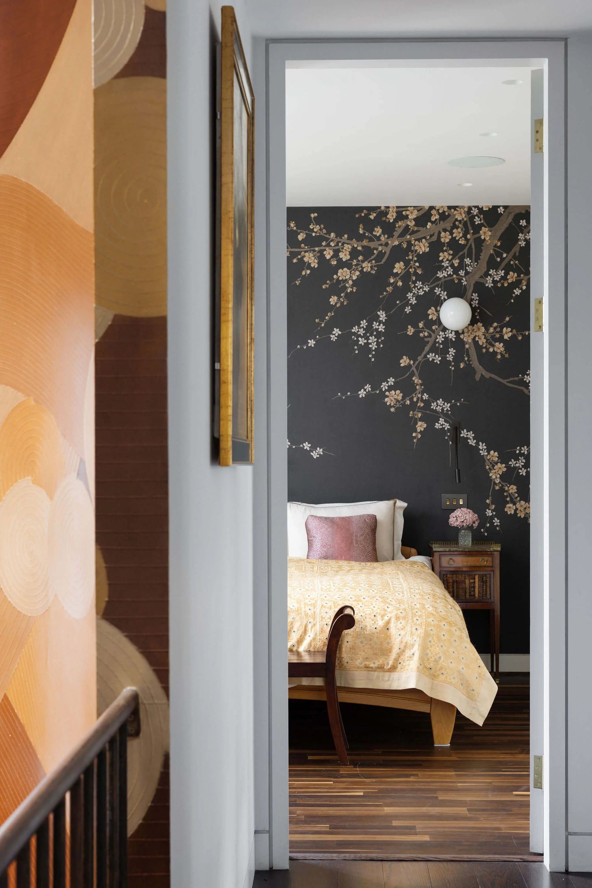
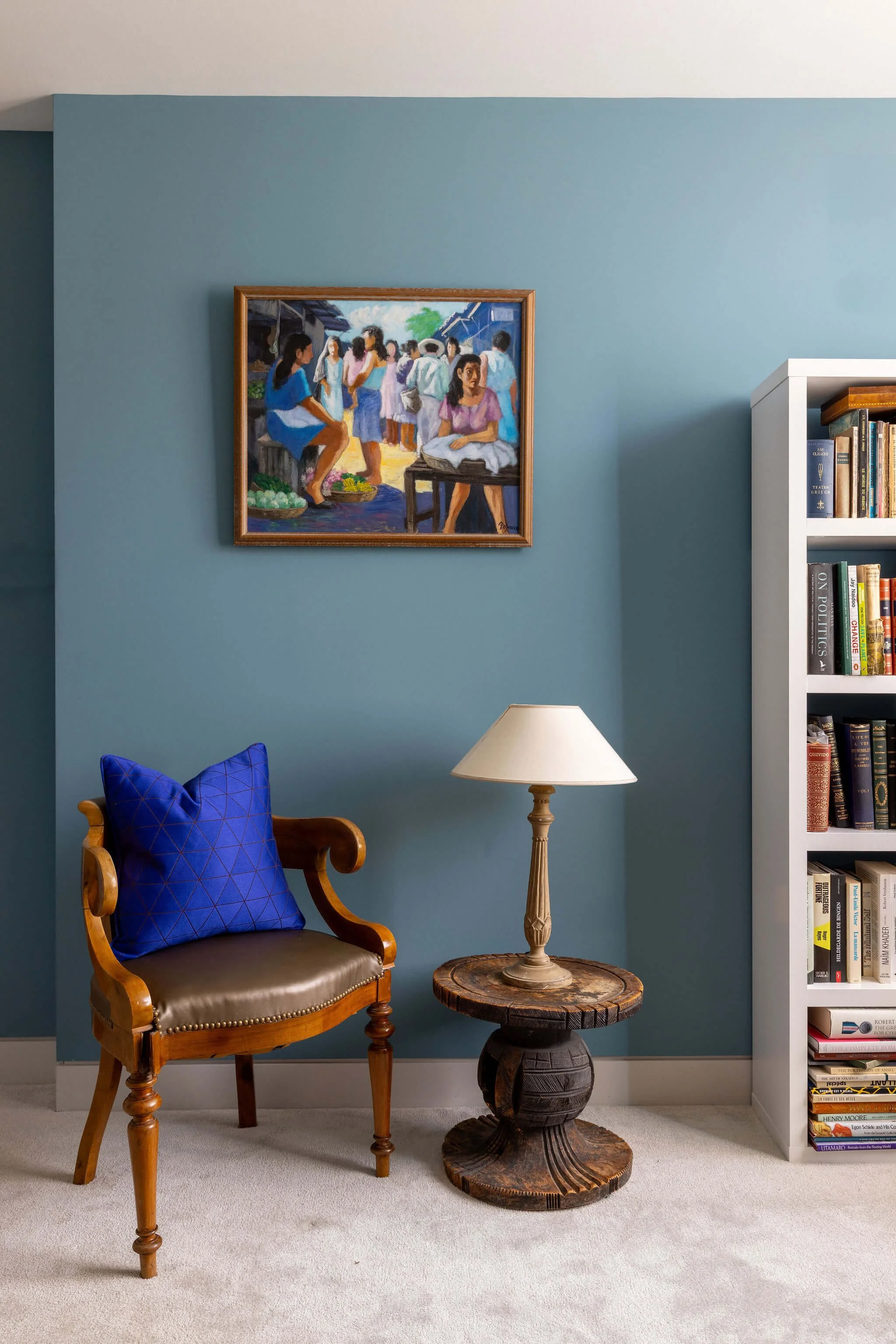
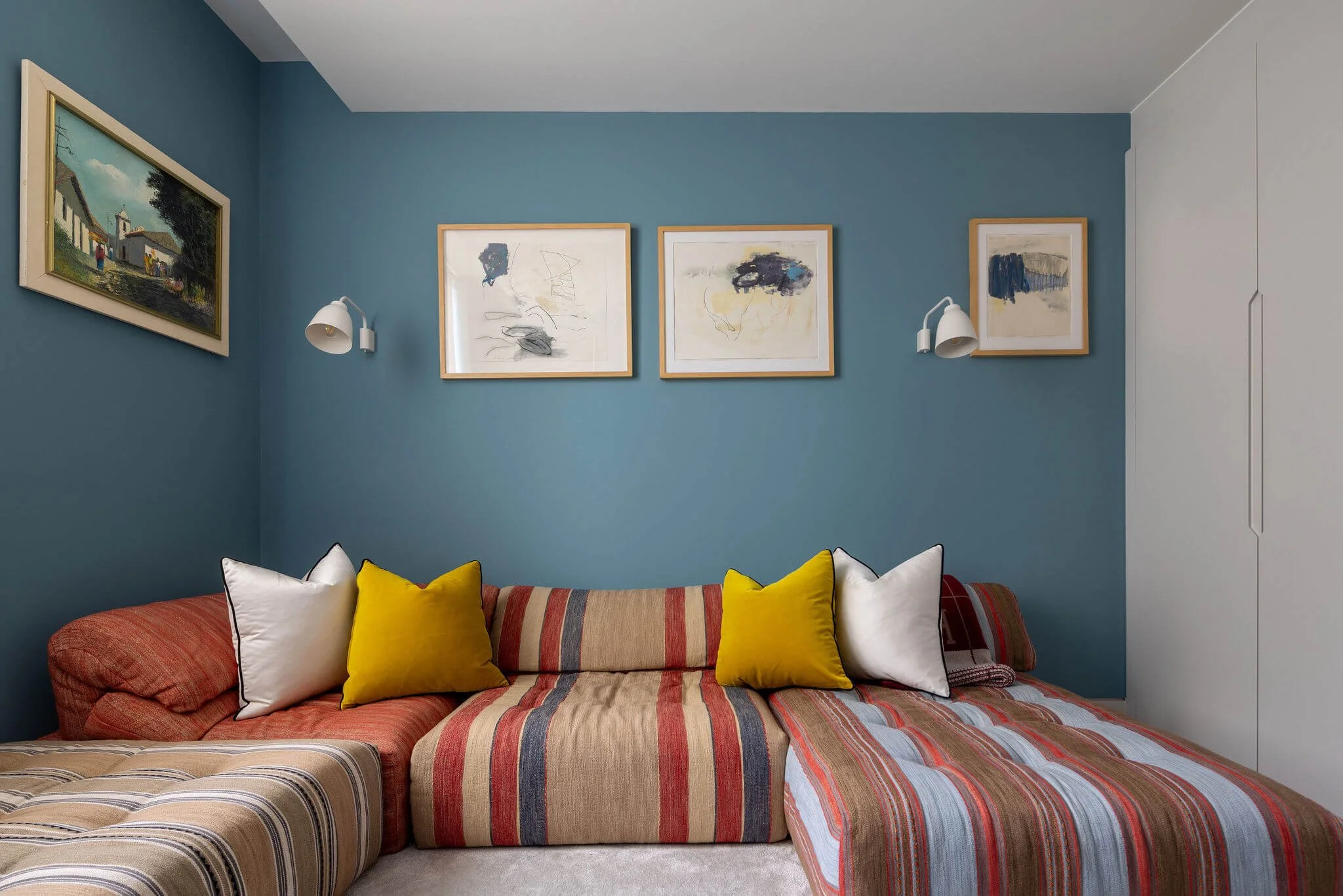
Every paint colour and wallpaper was chosen in direct response to the collection it would hold. This is not unusual in principle. What was unusual here was the range of reference the collection demands. Works from European modernist traditions sit alongside pieces from Latin American abstraction. Asian decorative objects of considerable age and beauty. Textiles, ceramics, things acquired at gallery openings and things found in markets in cities the clients know well.
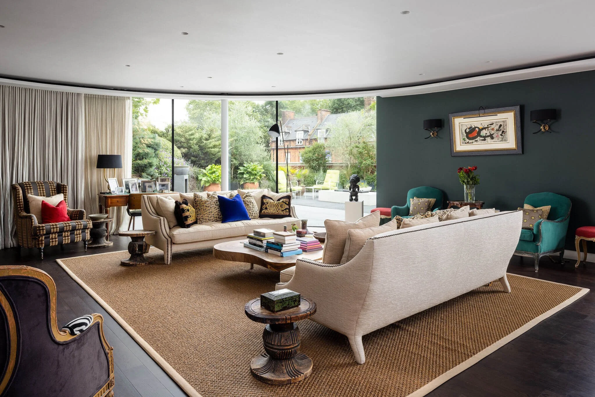
The palette that emerged is not a single register. Different rooms carry different notes: warmer and more saturated where the collection is densest, quieter and more withdrawn where the objects themselves are the most powerful presence. The overall effect is of a home that has been lived in by people of genuine taste and genuine curiosity over a long period of time. Which is, in every sense that matters, exactly what it is.
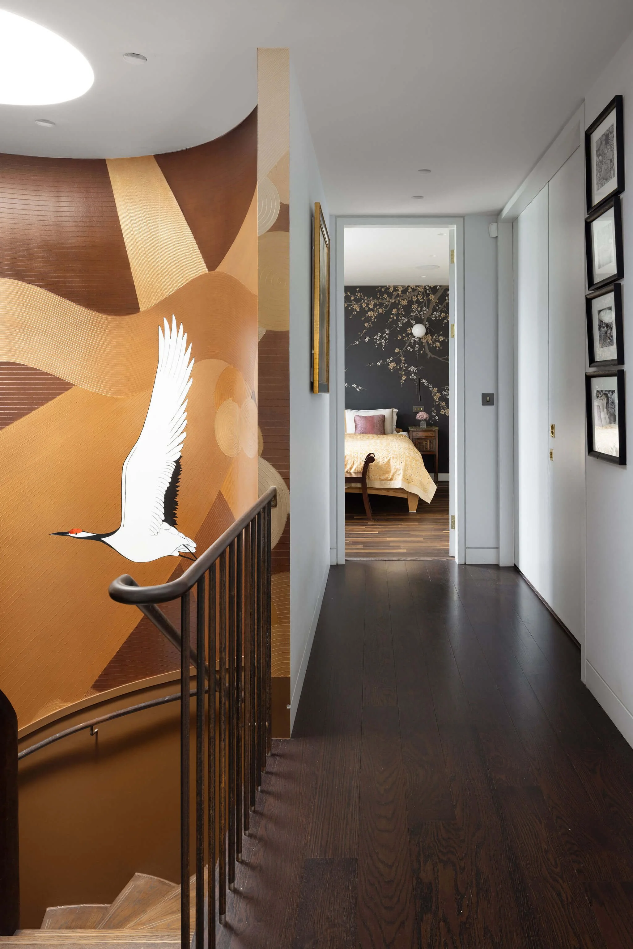
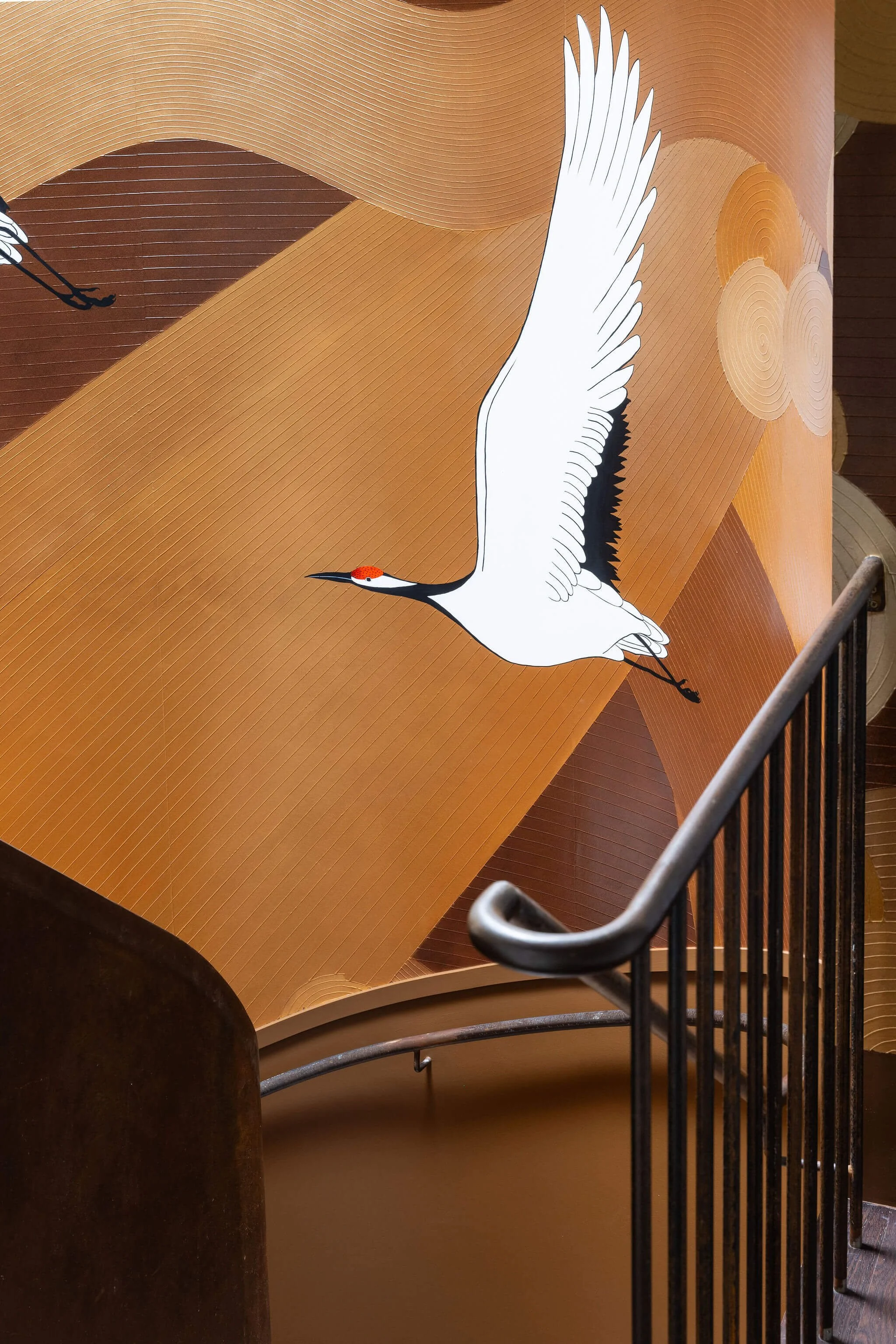
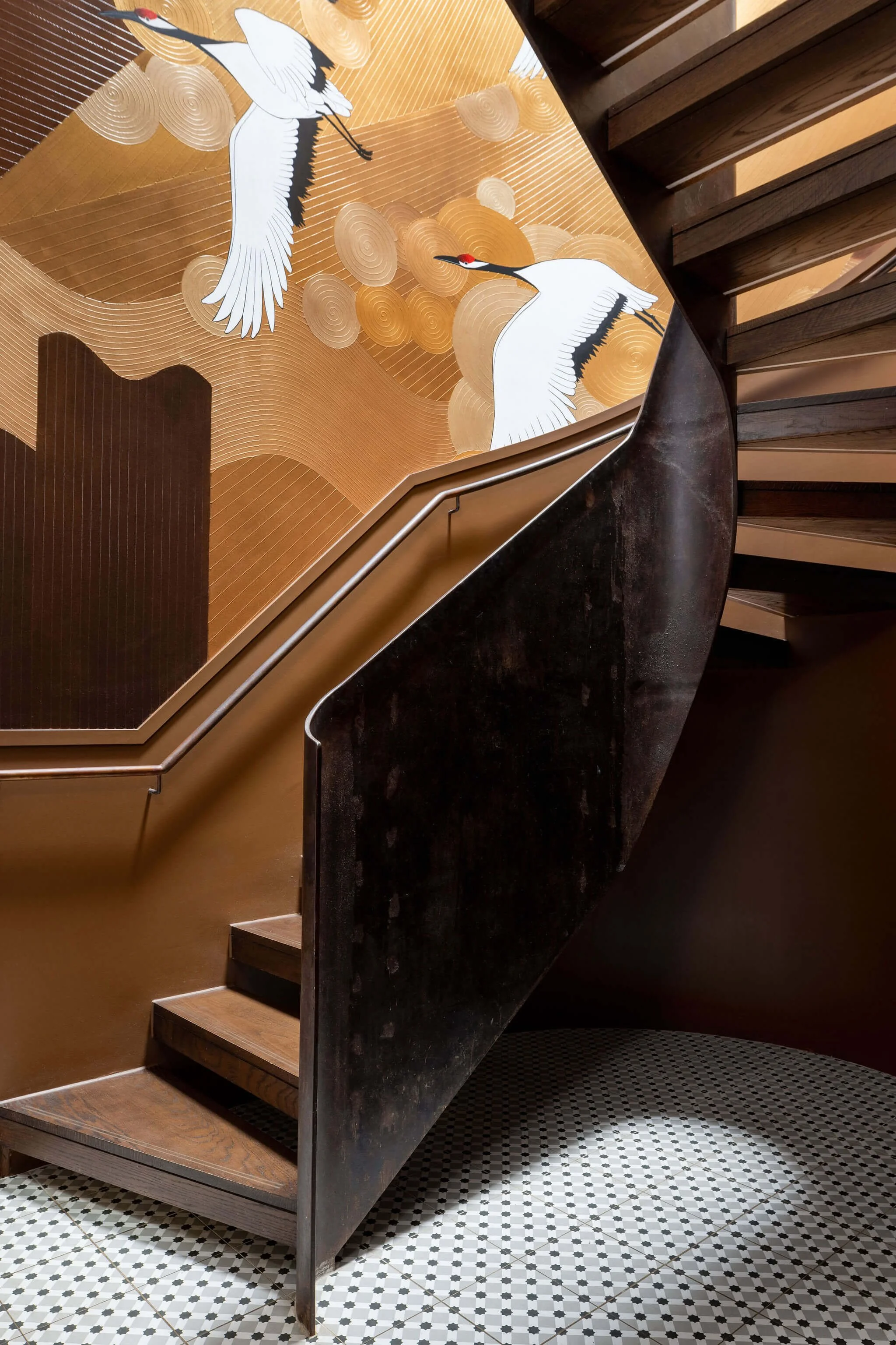
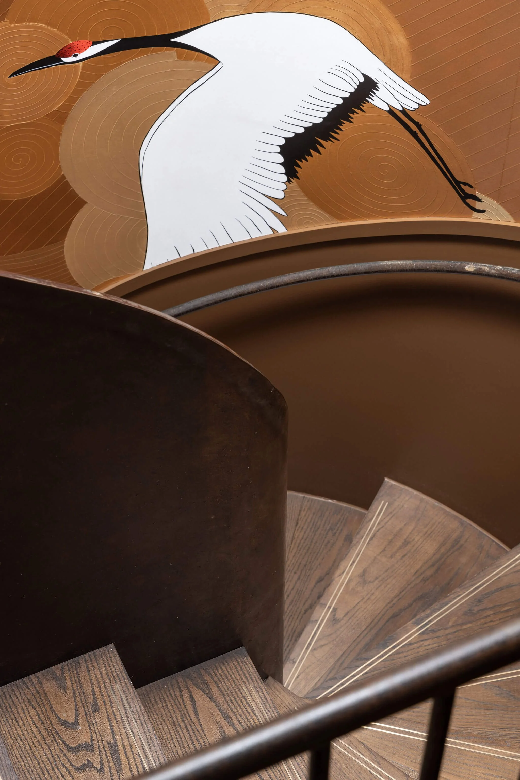
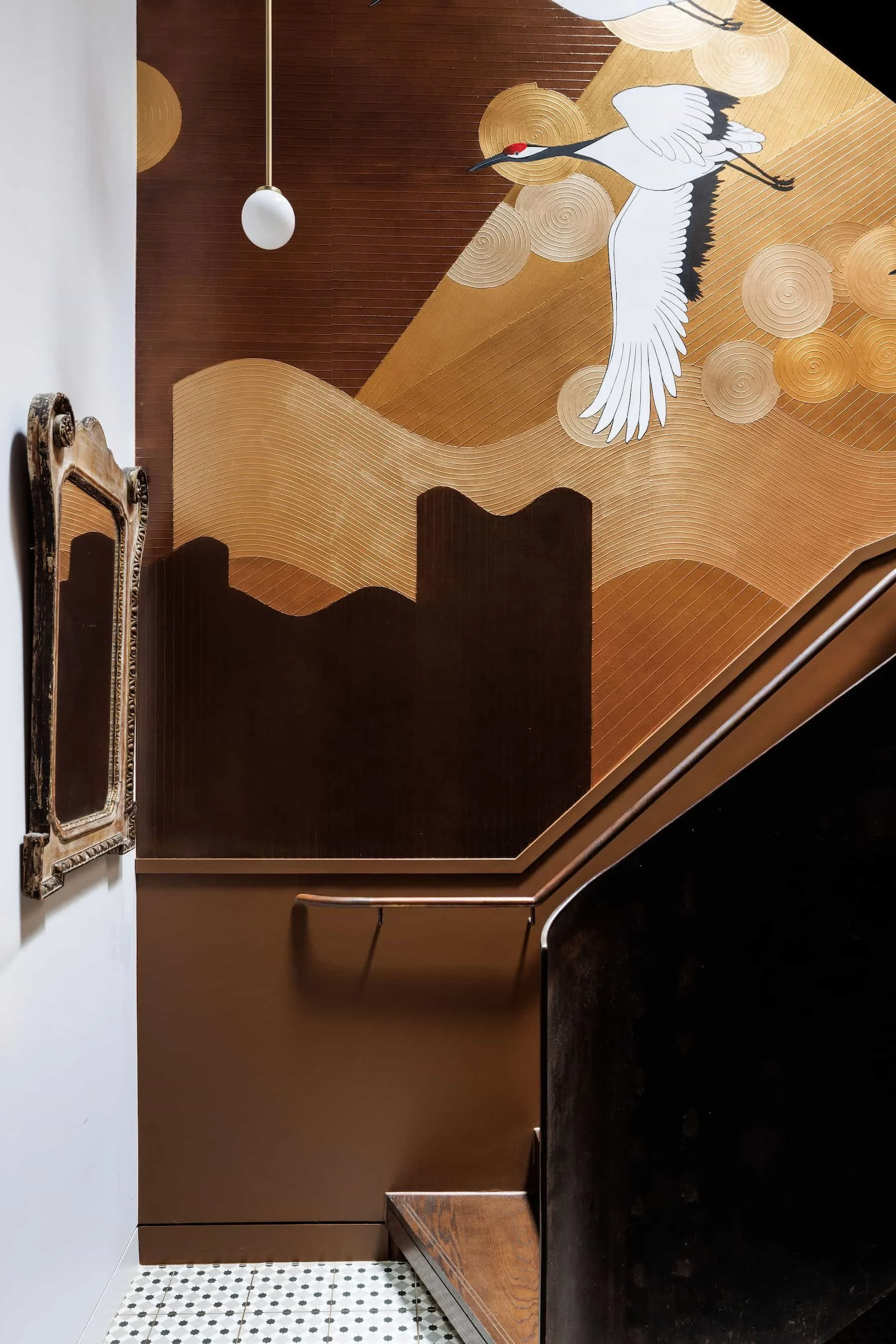
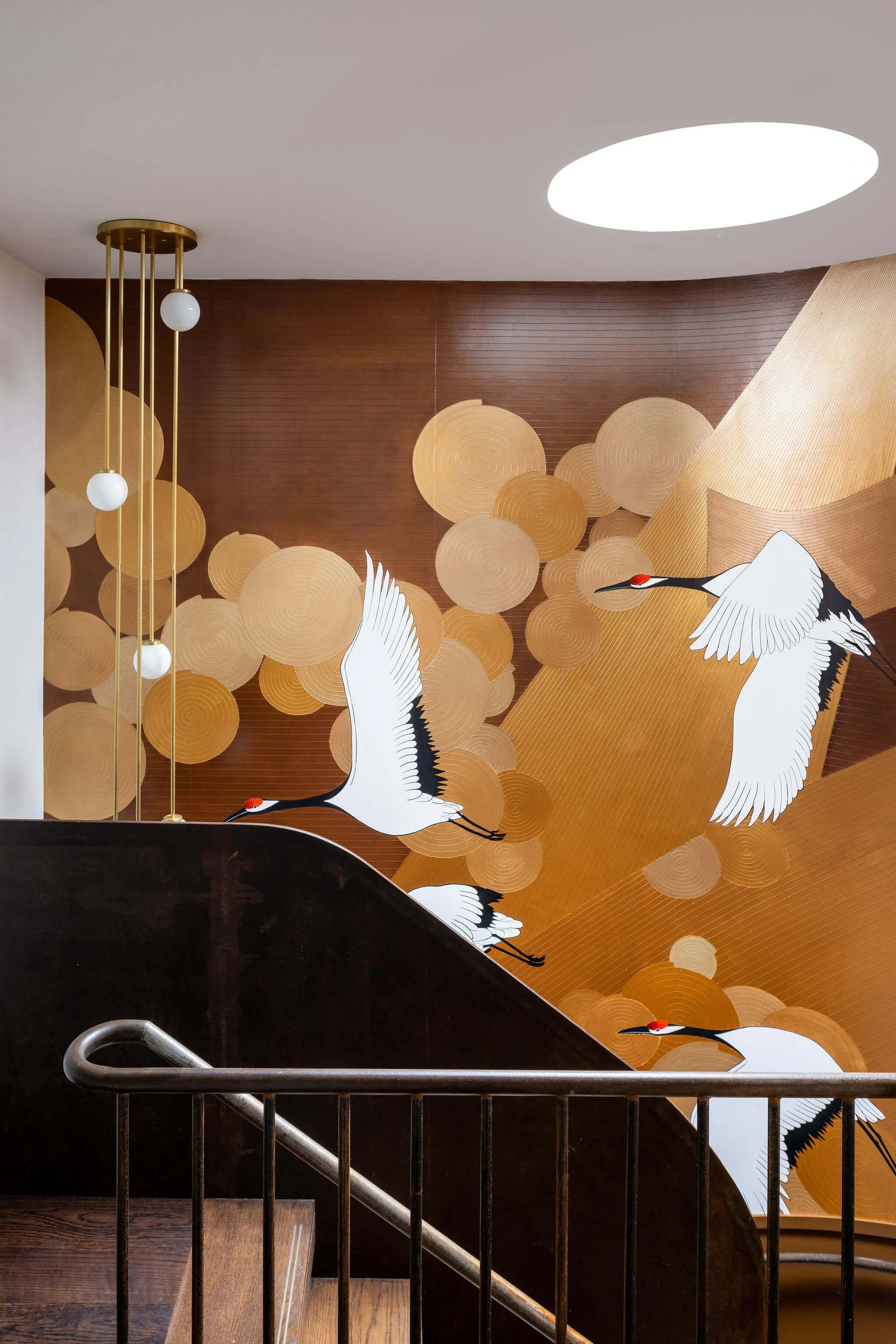
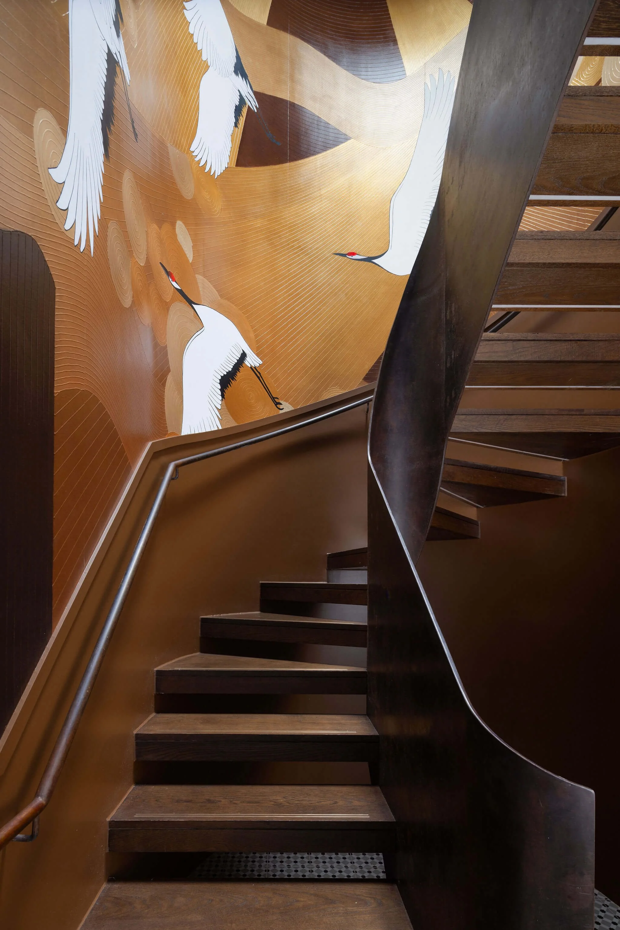
The Staircase
The one gesture that could afford to be visible.
In a project defined by restraint and the deliberate suppression of the designer's hand, the staircase offered a single opportunity for something more overt. The double-height space connecting the two floors of the duplex is one of the apartment's most architecturally generous features. The eye is drawn to it from multiple points in the living space. It catches light differently at different times of day. It demanded a response worthy of its scale.
We commissioned a bespoke painted artwork for the staircase walls. An interpretation of the de Gournay tradition, worked through our own artist collaboration, with flying swans ascending through the space. The decision to reference de Gournay was deliberate. It is a tradition that carries European decorative history while remaining entirely contemporary in its application, and it speaks to the clients' cultural range without belonging too specifically to any single part of it. The swans rise through both floors, the painted surface shifting in tone and density as it climbs, the whole thing arriving as though it has always been there and the apartment was built around it.
It is, in a project of studied understatement, the one moment of declared beauty. It earns it.
“The apartment needed to look effortless. That effortlessness was the entire project.”
The COLLECTION
Objects that carry the weight of a life.
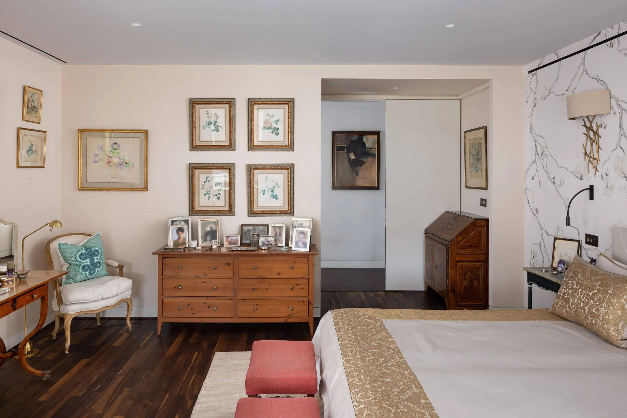
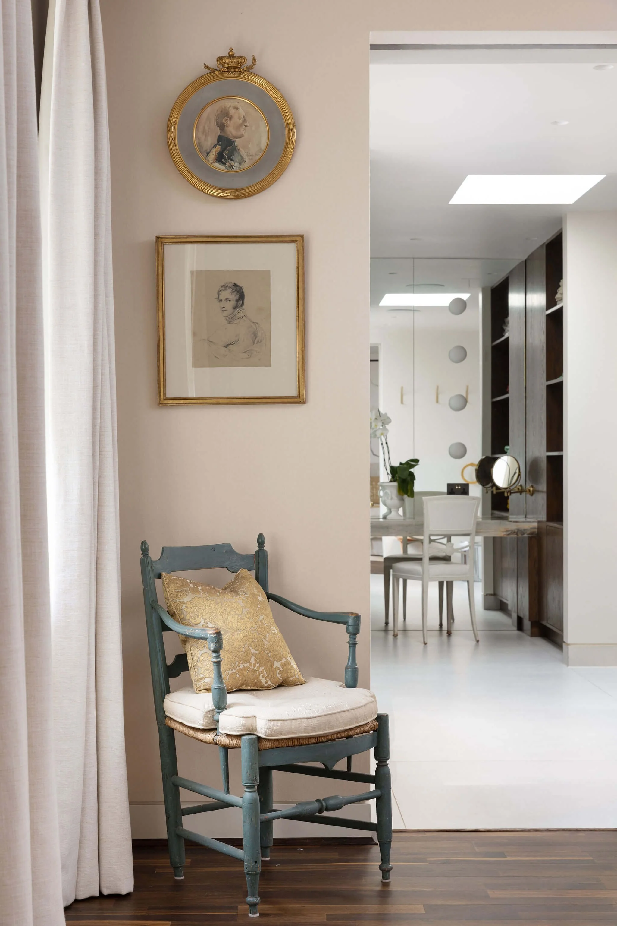
The art hanging and object placement in this project involved decisions of considerable delicacy. A collection assembled with this level of personal investment and cultural knowledge has its own internal logic: relationships between pieces that the collector understands instinctively and that the designer must work to perceive and honour. An object placed wrongly in relation to another object nearby is not merely an aesthetic mistake. It is a misreading of the story.
We worked through the placement of every significant piece. Which wall, which height, which light, which relationship to the objects around it. European paintings were hung where the north light from the Heath serves them best. Latin American works, many of them more saturated in colour and more emphatic in their presence, were given walls whose painted backgrounds support rather than compete with them. Asian pieces were placed where their scale and material character could be fully appreciated, with space around them rather than in conversation they were not designed for.
The lighting was designed with the same specificity. Each significant work has its own considered light source, calibrated to reveal the surface quality of that particular piece rather than applying a general wash. The overall effect is of a private gallery that is also, unmistakably, a home. That is one of the most difficult effects in residential design to achieve. It is also one of the most rewarding.

The Result
A life at home in itself.
When the clients returned to the completed apartment, what they found was not a newly decorated home. They found their home: the one they had always had, finally in the right place. The objects looked as though they had been there for years. The colours felt as though they had grown from the collection rather than been applied to its walls. The staircase painting felt as though the building had been designed around it.
This is the ambition we hold for every project. The designer disappears entirely, and what remains is the life of the people who live there, expressed with more clarity than they could have managed alone. In this apartment, near the Heath, with a couple whose lives have touched more of the world than most people ever see, that ambition was met.

CITY
Urban Sophistication

Surf
Coastal Serenity

Ski
Alpine Craft
Every home begins with a conversation.
Every project begins with a conversation.
If you are considering a home and would like to talk through your ideas, we would be glad to hear from you.