
City Life in Colour
Interior Decorating
city | maida vale, london

A Maida Vale apartment brought to life through fearless colour — where jewel-toned furnishings, bold pattern and a collector’s eye transform a city home into something joyfully, unapologetically vivid.
LOCATION: Maida Vale, London
PROJECT TYPE: Interior Decorating
SCOPE: Interior Design · Colour Consultation · Full Furnishing · Bespoke Joinery · Window Treatments · Lighting Design · Art Sourcing and Curation · Styling · Turnkey Project Management

The most distinctive thing about this project is what was not done. No walls moved. No structural changes. No contractors beyond decorators, electrician and joiners. The transformation was achieved entirely through paint, window treatments, bespoke joinery, furniture, lighting and art. And yet the apartment the clients returned to bore no resemblance to the one they had purchased.
The clients, a professional couple with two grown-up daughters, had bought this spacious three-bedroom apartment in a smart stucco-fronted street in Maida Vale as their city base. A place to host dinner parties, spend weeknights after work or theatre, before heading back to the country for the weekend. We were appointed to oversee the redecoration and to furnish everything as a complete turnkey project.
This is the kind of brief that requires perhaps the most refined design judgment of all. Knowing what decoration alone can achieve, and having the confidence to push it to its full extent.


“Claudia and her team were great to work with! They brought so much creativity and fresh thinking to our home. After a lifetime of neutrals, our brief was for a home full of colour - with minimal white, grey, beige, or cream. Left to my own devices, any colour choices would have been a disaster, but Claudia really understood what we were after. They created joyful, vibrant rooms that use colour and pattern effectively, and they encouraged us to be bold in the best possible way. The result is fabulous and exactly what we wanted. Each room feels individual yet ties together beautifully with nothing being too “matchy-matchy,” giving the whole home a cohesive and uplifting feel. I also really appreciated how the team helped with all the finishing touches, from the big design decisions down to the small details that pull everything together.”
—Client, city life in colour, london
THE BRIEF
White walls, openly rejected.
The client knew her own limitations and was entirely honest about them. She would never be able to make it work herself and wanted us to select everything down to the last detail. It is one of the most trusting briefs a designer can receive, and one of the most demanding: total responsibility for every decision, from the paint on the walls to the last cushion on the bed.
Her instinct was white walls. We discussed this openly. A city apartment used for short, vibrant stays in London, for theatre, dinners, weeknights, the full energy of the capital, ought to feel different from the country house it supplements. Not a pale version of it. A deliberate contrast: richer, bolder, more concentrated in its pleasure. Short stays in London ought to be cherished as vibrant variations. A more daring colour scheme was not just permitted. It was the whole point.


the palette
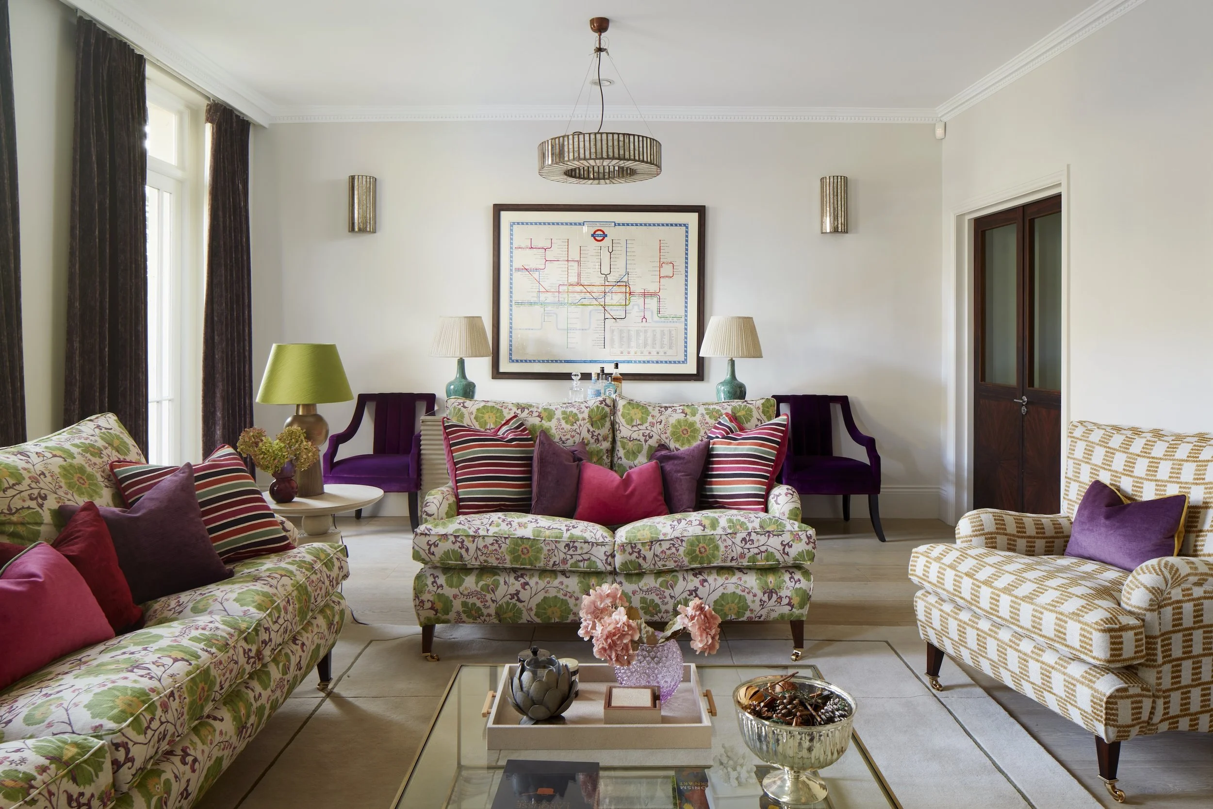
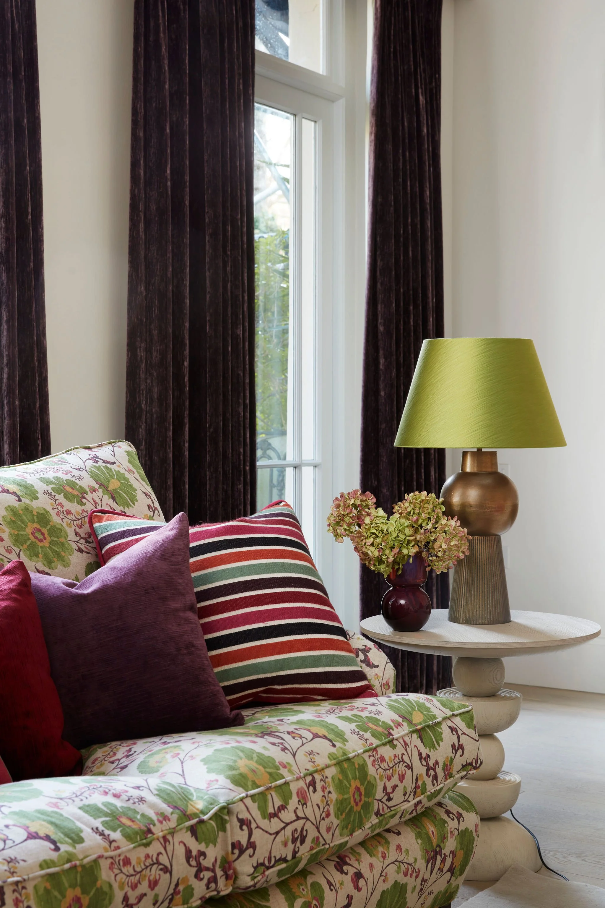
Anchored in green. Layered in colour.
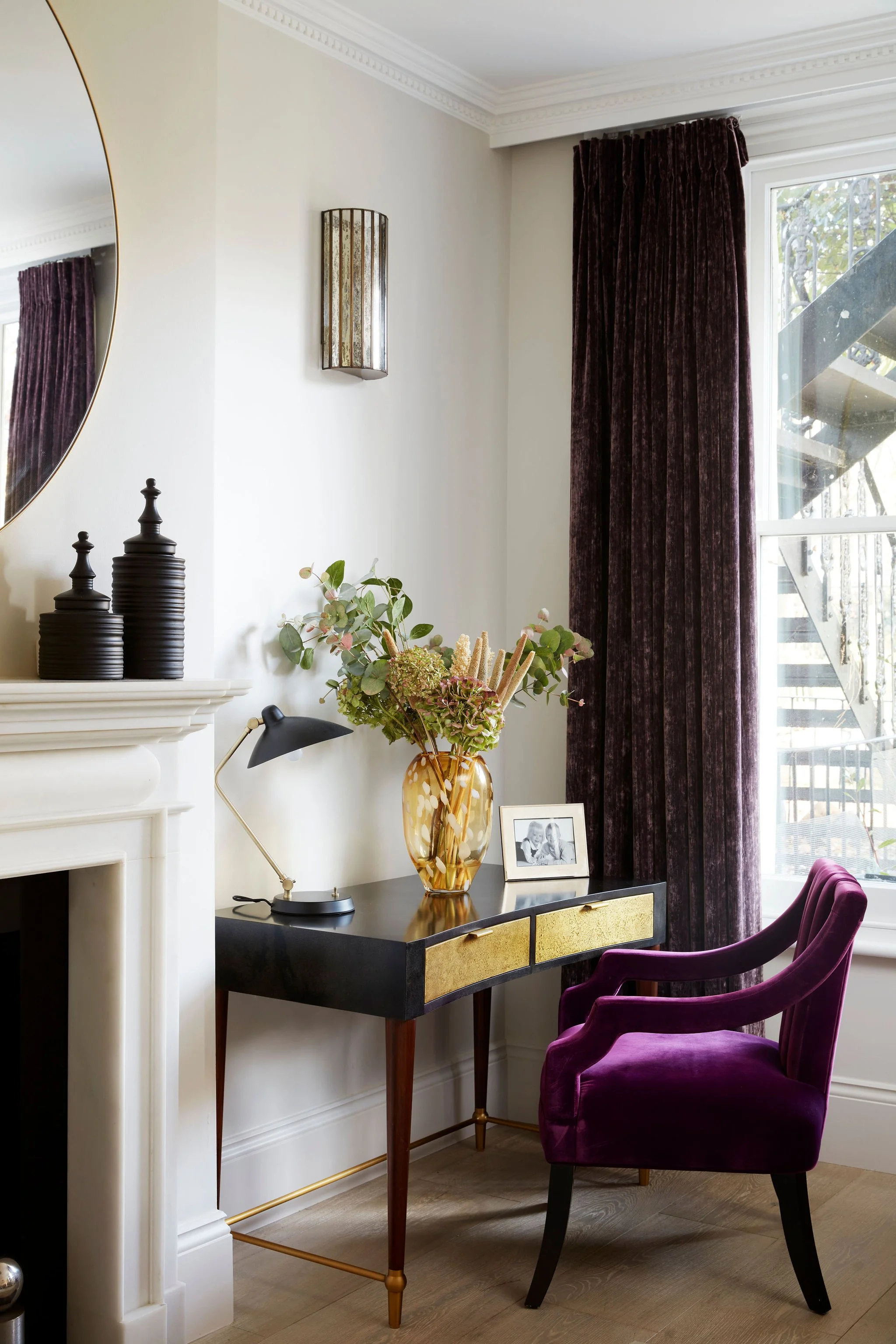
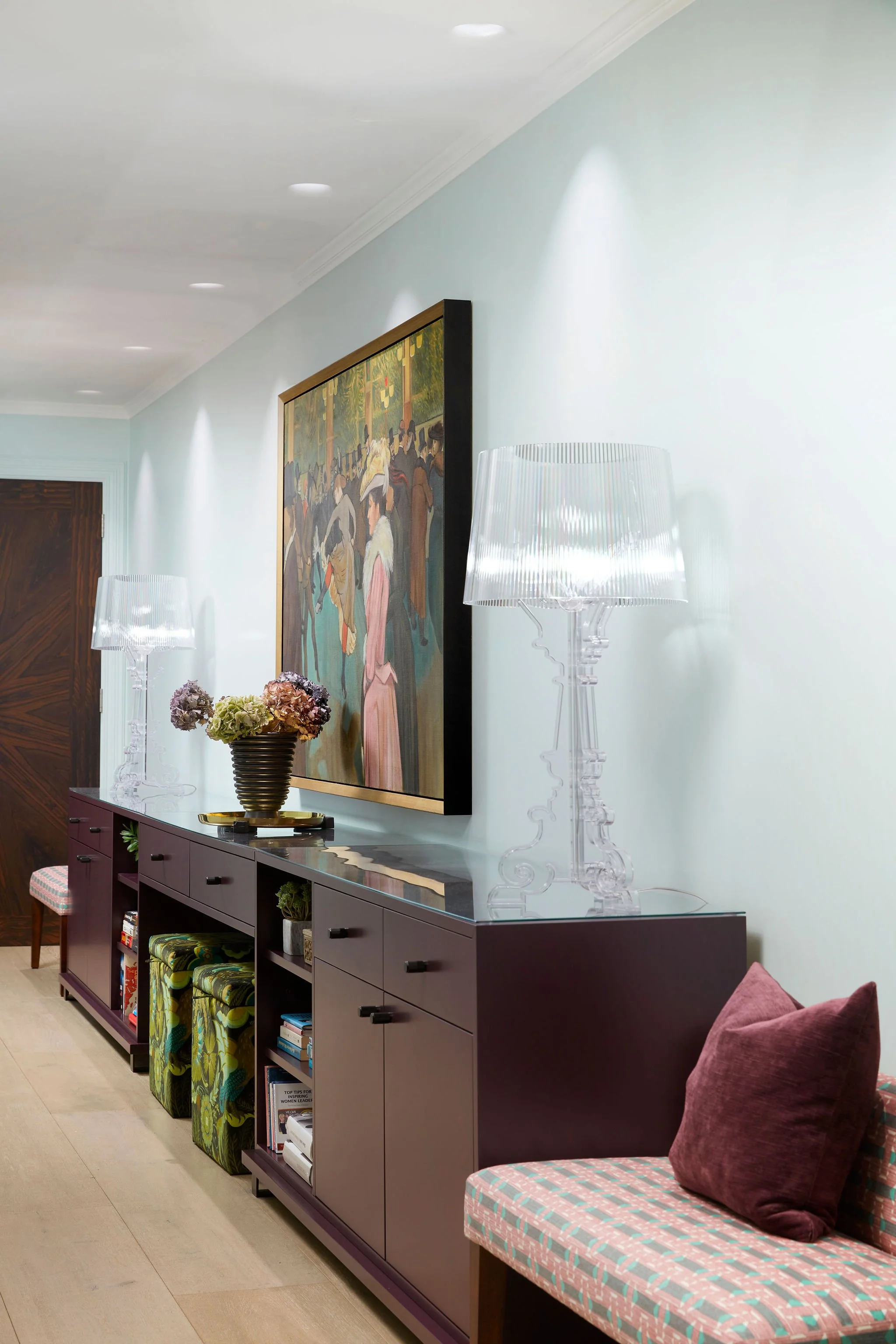
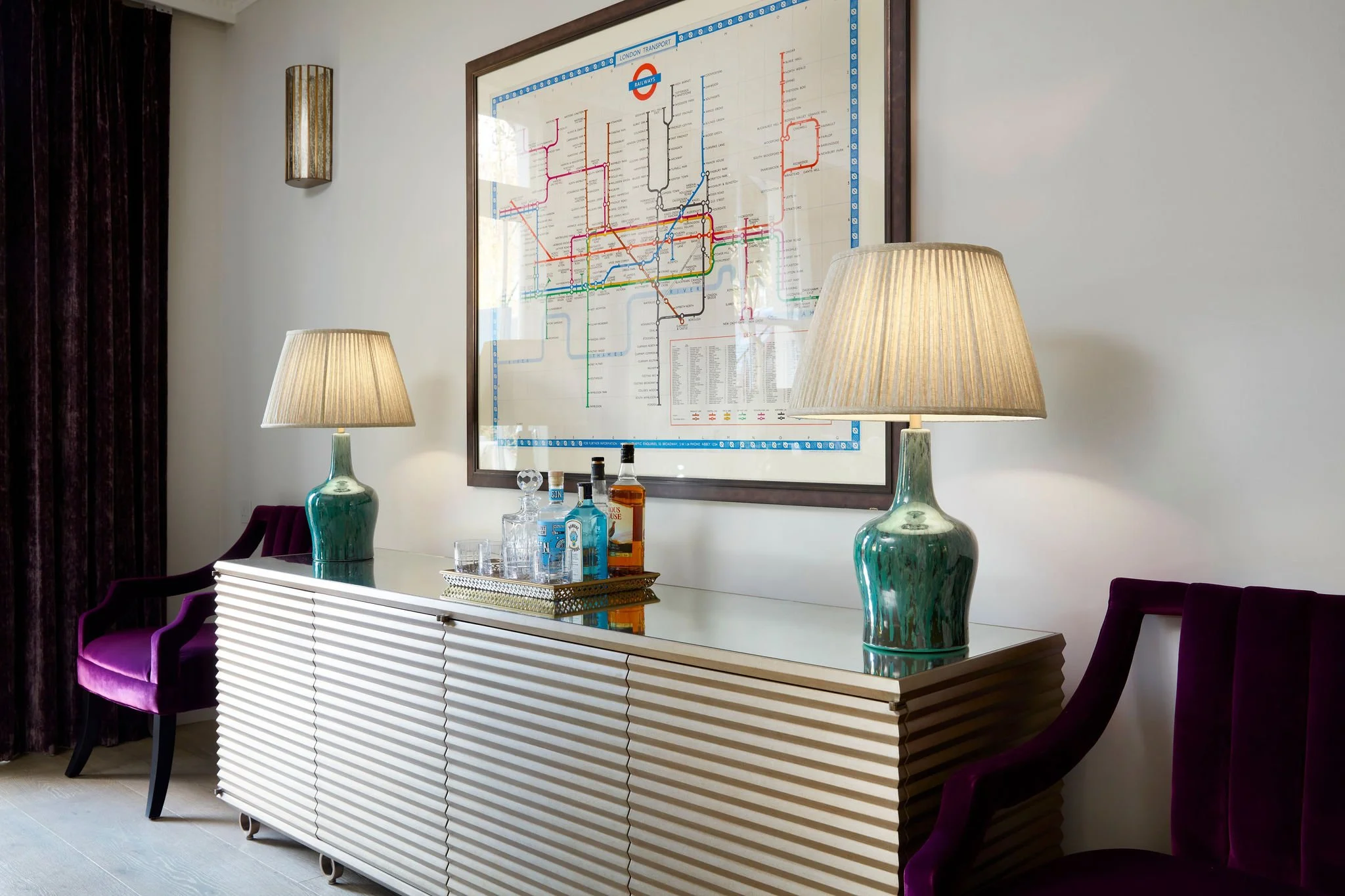
The palette grew from what was already visible from the main rooms: the lush green foliage of the communal gardens beyond the windows. We worked outward from that anchor. Walls in shades of mint green, soft pink and plaster. Rich purples, pinks, orange and copper running through the fabrics, upholstery and art. It is a combination that feels simultaneously botanical and urban: the garden brought inside, given the intensity of the city.
Colour was not confined to the walls. It runs through every layer of the apartment: upholstery, curtain fabrics, bedlinen, lampshades, the painted surfaces of bespoke joinery. The effect is of a scheme that has grown from a single consistent idea rather than been assembled from separate decisions. That coherence, across rooms, across surfaces, across scales, is what makes a decorated apartment feel genuinely resolved rather than merely furnished.


the space planning
Not a wall moved. Every room reconsidered.
The apartment has a generous layout, but one oddity of the conversion from single dwelling into flats is that a large passage area in the kitchen has very little daylight. We recommended placing the dining area in this darker section, which freed up more generous entertainment space in the reception room. The reception became what it should always have been: a room for gathering, for conversation, for the kind of evening the clients had bought the apartment to enjoy.
In the kitchen, the vibrant mint walls and copper pendant lights, paired with reflective surfaces of marble, glass backsplash and mirrors, make the space feel much fresher than its proportions might suggest. We replaced the old halogen downlights with the best quality LED throughout, which resulted in significantly improved colour rendering. The colour of a room is only as good as the light that falls on it. It is a change most clients do not anticipate and immediately feel.
The long corridor is extra wide, a feature of the original building that most conversions simply ignore. We used this opportunity to commission a bespoke hallway unit providing additional storage for shoes and books, and a compact work-from-home desk space. The corridor that had been a thoroughfare became a room in its own right.


the bedrooms
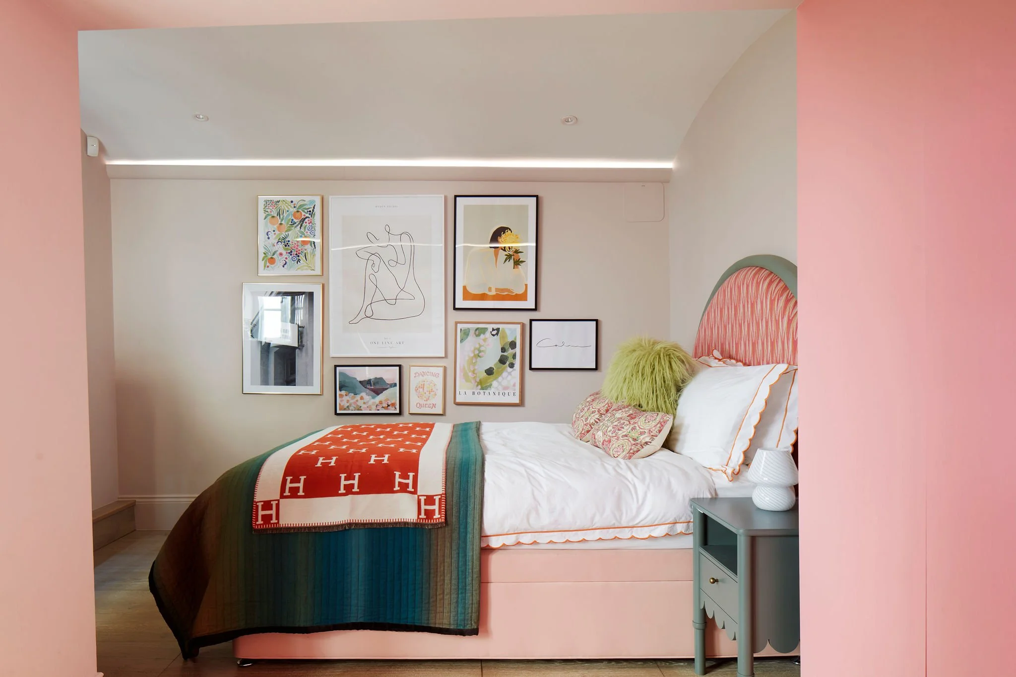
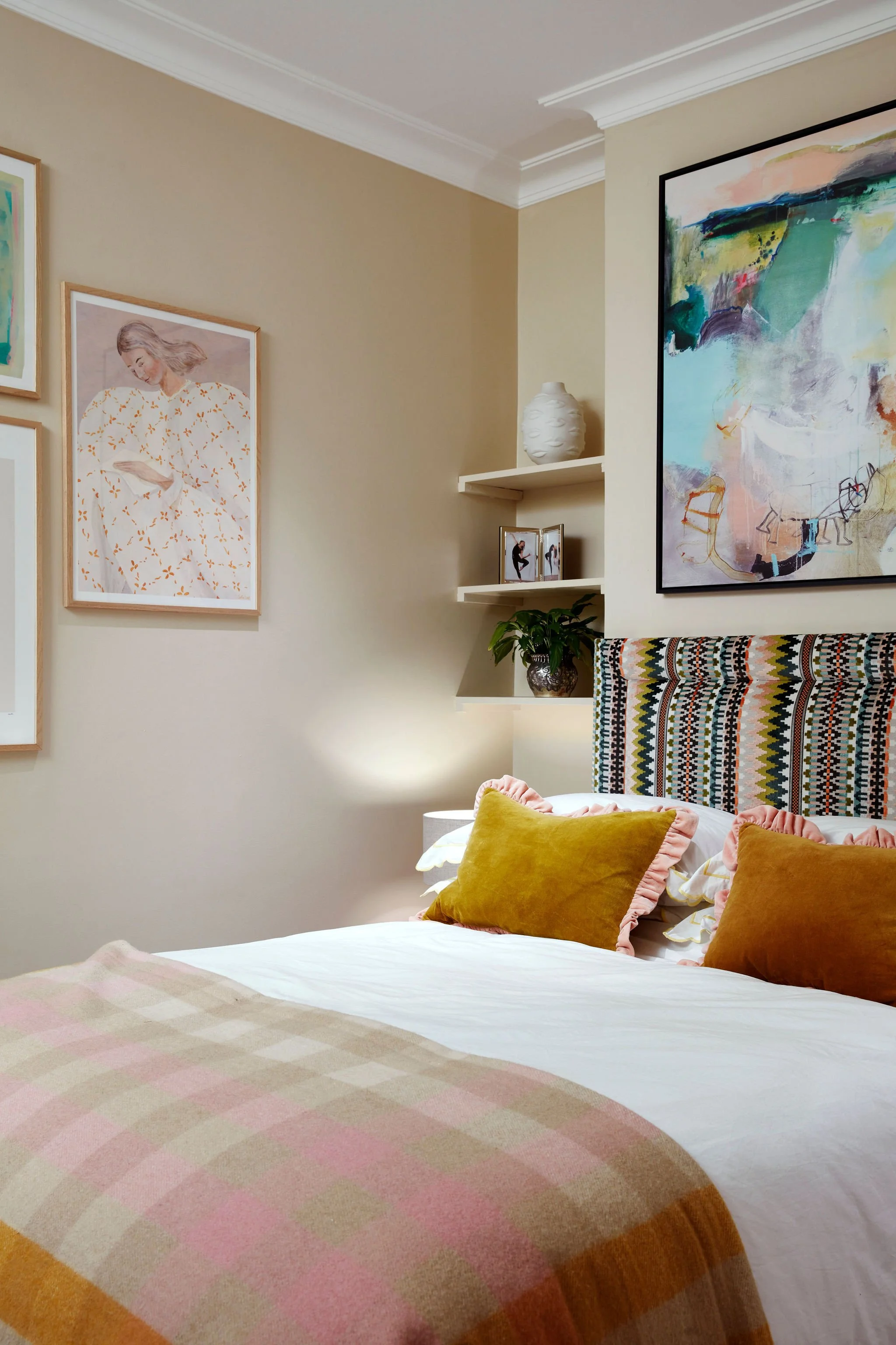
Three rooms. Three palettes. One scheme.
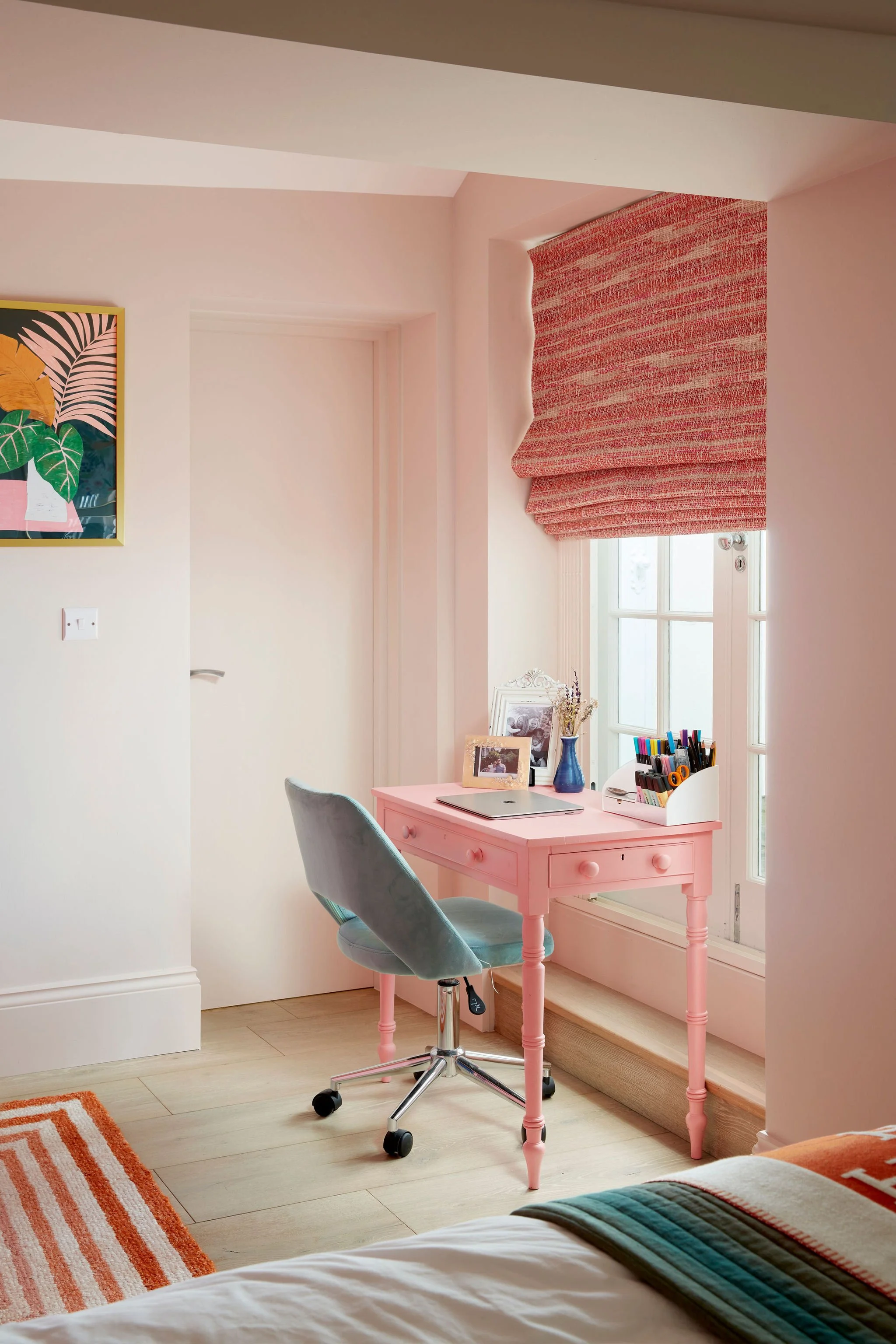
The two daughters chose their own schemes: pinks and oranges, each room its own expression within the wider palette of the apartment. We added a desk to each bedroom to allow for work-from-home flexibility, a practical acknowledgment that a city base serves multiple purposes at different times and that comfort and function are not in competition.
We notice consistently that clients are more willing to engage with new ideas and take considered risks on second homes. There is a freedom that comes from knowing a space will be used in a particular, concentrated way, for pleasure, for energy, for the specific quality of London life, that allows bolder choices to be made and sustained. The apartment became, in every room, a deliberate contrast to the white walls and open spaces of the country.
the art
Sourced widely. Placed precisely.
A crucial ingredient in each bedroom scheme and throughout the property was the search for art that would give the walls the life that paint alone cannot provide. We relished the opportunity to adorn the apartment with a considered mix: vintage oil paintings found through our sourcing network, modern abstract oils, colourful graphic reproductions and prints. The selection process was guided by the palette of each room and by the quality and character of individual pieces, not by budget alone, though the brief asked us to work within accessible price points.
Affordable art, chosen with a genuine eye, does more for a room than expensive art chosen carelessly. The walls of this apartment hold that conviction throughout. Every piece was placed in relation to the room around it: its scale, its colour, its relationship to the furniture below and the ceiling above. Art that is simply hung is one thing. Art that is curated is another.
“Short stays in London ought to be cherished as vibrant variations. A more daring colour scheme was not just permitted - it was the whole point.”

CITY
Urban Sophistication

Surf
Coastal Serenity

Ski
Alpine Craft
Every home begins with a conversation.
Every project begins with a conversation.
If you are considering a home and would like to talk through your ideas, we would be glad to hear from you.